Androidstudio六大基本布局详解
Android中常用的布局方式有以下几种:
(一)线性布局LinearLayout
(二)相对布局RelativeLayout
(三)表格布局TableLayout
(四)帧布局FrameLayout
(五)绝对布局AbsoluteLayout
(六)网格布局GridLayout
Android中常用的布局方式有以下几种: 线性布局LinearLayout相对布局RelativeLayout表格布局TableLayout层布局FrameLayout绝对布局AbsoluteLayout网格布局GridLayout(一)线性布局LinearLayout用的相对较多的是线性布局和相对布局。接下来重点演示这两种布局
其中,表格布局是线性布局的子类。网格布局是android 4.0后新增的布局。
线性布局中最重要的属性:orientation
horizontal(水平布局)和vertical(垂直布局)两种方式
属性名
orientation 布局方式,有horizontal(水平布局)和vertical(垂直布局)两种方式
id 组件名称
layout_width 该组件的宽度
layout_height 该组件的高度
layout_weight 权重
layout_gravity 该组件(在父容器)中的对齐方式
gravity 该组件所含子组件在其内部的对齐方式
background 设置背景图片或填充颜色
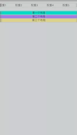
效果图
<?xml version="1.0" encoding="utf-8"?>
<LinearLayout xmlns:android="http://schemas.android.com/apk/res/android"
    android:layout_width="match_parent"
    android:background="@color/gray"
    android:layout_height="match_parent"
    android:orientation="vertical">
    <LinearLayout
        android:layout_marginTop="20dp"
        android:layout_width="match_parent"
        android:orientation="horizontal"
        android:layout_height="wrap_content">
        <TextView
            android:text="权重1"
            android:layout_width="0dp"
            android:layout_weight="1"
            android:layout_height="wrap_content"/>
        <TextView
            android:text="权重2"
            android:layout_width="0dp"
            android:layout_weight="1"
            android:layout_height="wrap_content"/>
        <TextView
            android:text="权重3"
            android:layout_width="0dp"
            android:layout_weight="1"
            android:layout_height="wrap_content"/>
        <TextView
            android:text="权重4"
            android:layout_width="0dp"
            android:layout_weight="1"
            android:layout_height="wrap_content"/>
        <TextView
            android:text="权重5"
            android:layout_width="0dp"
            android:layout_weight="1"
            android:layout_height="wrap_content"/>
    </LinearLayout>
    <LinearLayout
        android:layout_marginTop="20dp"
        android:background="@color/teal_200"
        android:layout_width="match_parent"
        android:gravity="center"
        android:layout_height="wrap_content">
        <TextView
            android:text="第一个布局"
            android:layout_width="wrap_content"
            android:layout_height="wrap_content"
            />
    </LinearLayout>
    <LinearLayout
        android:background="@color/purple"
        android:layout_width="match_parent"
        android:gravity="center"
        android:layout_height="wrap_content">
        <TextView
            android:text="第二个布局"
            android:layout_width="wrap_content"
            android:layout_height="wrap_content"
            />
    </LinearLayout>
    <LinearLayout
        android:background="@color/teal"
        android:layout_width="match_parent"
        android:gravity="center"
        android:layout_height="wrap_content">
        <TextView
            android:text="第三个布局"
            android:layout_width="wrap_content"
            android:layout_height="wrap_content"
            />
    </LinearLayout>
</LinearLayout>
(二)相对布局RelativeLayout
属性:
android:layout_marginTop=“25dip” //顶部距离
android:gravity=“left” //空间布局位置
android:layout_marginLeft="15dip //距离左边距
相对于给定ID控件
android:layout_above 将该控件的底部置于给定ID的控件之上;
android:layout_below 将该控件的底部置于给定ID的控件之下;
android:layout_toLeftOf 将该控件的右边缘与给定ID的控件左边缘对齐;
android:layout_toRightOf 将该控件的左边缘与给定ID的控件右边缘对齐;
android:layout_alignBaseline 将该控件的baseline与给定ID的baseline对齐;
android:layout_alignTop 将该控件的顶部边缘与给定ID的顶部边缘对齐;
android:layout_alignBottom 将该控件的底部边缘与给定ID的底部边缘对齐;
android:layout_alignLeft 将该控件的左边缘与给定ID的左边缘对齐;
android:layout_alignRight 将该控件的右边缘与给定ID的右边缘对齐;
相对于父组件
android:layout_alignParentTop 如果为true,将该控件的顶部与其父控件的顶部对齐;
android:layout_alignParentBottom 如果为true,将该控件的底部与其父控件的底部对齐;
android:layout_alignParentLeft 如果为true,将该控件的左部与其父控件的左部对齐;
android:layout_alignParentRight 如果为true,将该控件的右部与其父控件的右部对齐;
居中
android:layout_centerHorizontal 如果为true,将该控件的置于水平居中;
android:layout_centerVertical 如果为true,将该控件的置于垂直居中;
android:layout_centerInParent 如果为true,将该控件的置于父控件的中央;
指定移动像素
android:layout_marginTop 上偏移的值;
android:layout_marginBottom 下偏移的值;
android:layout_marginLeft 左偏移的值;
android:layout_marginRight 右偏移的值;
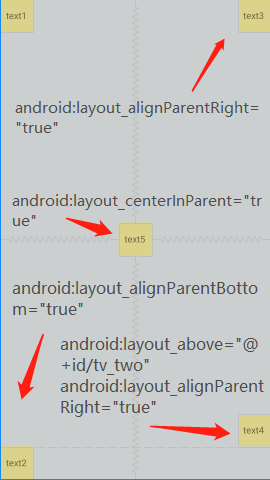
效果图
<?xml version="1.0" encoding="utf-8"?>
<RelativeLayout xmlns:android="http://schemas.android.com/apk/res/android"
    android:layout_width="match_parent"
    android:background="@color/gray"
    android:layout_height="match_parent"
    android:orientation="vertical">
    <TextView
        android:gravity="center"
        android:background="@color/teal"
        android:text="text1"
        android:layout_width="50dp"
        android:layout_height="50dp"
        />
    <TextView
        android:id="@+id/tv_two"
        android:layout_alignParentBottom="true"
        android:gravity="center"
        android:background="@color/teal"
        android:text="text2"
        android:layout_width="50dp"
        android:layout_height="50dp"
        />
    <TextView
        android:layout_alignParentRight="true"
        android:gravity="center"
        android:background="@color/teal"
        android:text="text3"
        android:layout_width="50dp"
        android:layout_height="50dp"
        />
    <TextView
        android:layout_centerInParent="true"
        android:gravity="center"
        android:background="@color/teal"
        android:text="text5"
        android:layout_width="50dp"
        android:layout_height="50dp"
        />
    <TextView
        android:layout_above="@+id/tv_two"
        android:layout_alignParentRight="true"
        android:gravity="center"
        android:background="@color/teal"
        android:text="text4"
        android:layout_width="50dp"
        android:layout_height="50dp"
        />
</RelativeLayout>
(三)表格布局TableLayout
属性
三个常用属性
android:collapseColumns:设置需要被隐藏的列的序号
android:shrinkColumns:设置允许被收缩的列的列序号
android:stretchColumns:设置运行被拉伸的列的列序号
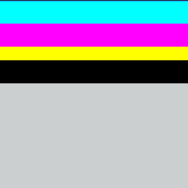
(四)帧布局FrameLayoutFrameLayout(帧布局)可以说是六大布局中最为简单的一个布局,这个布局直接在屏幕上开辟出一块空白的区域,当我们往里面添加控件的时候,会默认把他们放到这块区域的左上角,而这种布局方式却没有任何的定位方式,所以它应用的场景并不多;帧布局的大小由控件中最大的子控件决定,如果控件的大小一样大的话,那么同一时刻就只能看到最上面的那个组件!后续添加的控件会覆盖前一个!虽然默认会将控件放置在左上角,但是我们也可以通过layout_gravity属性,指定到其他的位置!
效果图
xml布局:
<?xml version="1.0" encoding="utf-8"?>
<FrameLayout xmlns:android="http://schemas.android.com/apk/res/android"
    android:layout_width="match_parent"
    android:background="@color/gray"
    android:layout_height="match_parent">
    <TextView
        android:background="#000000"
        android:layout_width="fill_parent"
        android:layout_height="180dp"/>
    <TextView
        android:background="#ffff00"
        android:layout_width="fill_parent"
        android:layout_height="130dp"/>
    <TextView
        android:background="#ff00ff"
        android:layout_width="fill_parent"
        android:layout_height="100dp"/>
    <TextView
        android:background="#00ffff"
        android:layout_width="fill_parent"
        android:layout_height="50dp"/>
</FrameLayout>
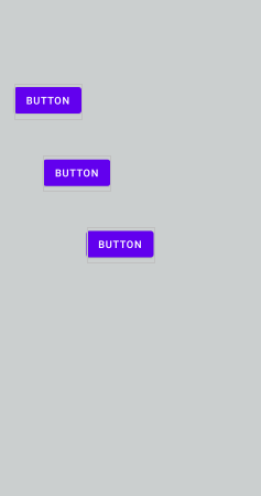
(五)绝对布局AbsoluteLayout
属性:
绝对布局又可以叫做坐标布局,可以直接指定子元素的绝对位置(xy)
由于手机屏幕尺寸差别比较大使用绝对定位的适应性会比较差,在屏幕的适配上有缺陷
常用属性:
android:foreground:*设置改帧布局容器的前景图像
android:foregroundGravity:设置前景图像显示的位置
android:layout_x=”” 控制当前子类控件的x位置
android:layout_y=”” 控制当前子类控件的y位置
效果图
.xml布局
(六)网格布局GridLayout和之前的TableLayout(表格布局) 有点类似,不过网格布局的好处是:
可以自己设置布局中组件的排列方式
可以自定义网格布局有多少行,多少列
可以直接设置组件位于某行某列
可以设置组件横跨几行或者几列
效果图
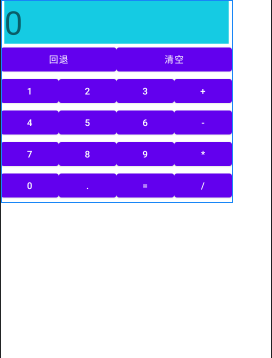
.xml布局:
<GridLayout xmlns:android="http://schemas.android.com/apk/res/android"
    xmlns:tools="http://schemas.android.com/tools"
    android:id="@+id/GridLayout1"
    android:layout_width="wrap_content"
    android:layout_height="wrap_content"
    android:columnCount="4"
    android:orientation="horizontal"
    android:rowCount="6" >
    <TextView
        android:layout_columnSpan="4"
        android:layout_gravity="fill"
        android:layout_marginLeft="5dp"
        android:layout_marginRight="5dp"
        android:background="#15CBE3"
        android:text="0"
        android:textSize="50sp" />
    <Button
        android:layout_columnSpan="2"
        android:layout_gravity="fill"
        android:text="回退" />
    <Button
        android:layout_columnSpan="2"
        android:layout_gravity="fill"
        android:text="清空" />
    <Button android:text="1" />
    <Button android:text="2" />
    <Button android:text="3" />
    <Button android:text="+" />
    <Button android:text="4" />
    <Button android:text="5" />
    <Button android:text="6" />
    <Button android:text="-" />
    <Button android:text="7" />
    <Button android:text="8" />
    <Button android:text="9" />
    <Button android:text="*" />
    <Button android:text="0" />
    <Button android:text="." />
    <Button android:text="=" />
    <Button android:text="/" />
</GridLayout>
<GridLayout android:layout_width=“fill_parent”:网格布局宽度为填满屏幕
<GridLayout android:layout_height=“wrap_content”:网格布局高度为包裹内容
<GridLayout android:columnCount=“4”:网格布局设置 4 列
<GridLayout android:rowCount=“6”:网格布局设置 6 行
<GridLayout android:layout_columnSpan=“2”:清空和回退横跨两列
<GridLayout android:orientation=“horizontal”:网格布局设置为水平布局
以上就是Android studio六大基本布局详解的详细内容,更多关于Android studio基本布局的资料请关注软件开发网其它相关文章!