ElementUI实现在下拉列表里面进行搜索功能详解
目录
分析:
html:
js:
css:
使用
总结
分析: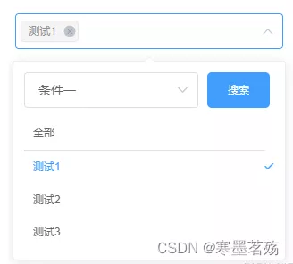
首先我们需要实现上图的效果,然后Element-UI的el-select是没有的,所以需要自己写
我们需要用到el-popover组件,然后使用它的v-model="visible"来实现控制显示
我们在el-popover的slot="reference" 放一个el-select使用popper-append-to-body="false"不需要插入浮动元素
使用popper-class="hide-popper"定义浮窗class为hide-popper,并设置display:none,这样选中了就不会存在el-select的下拉选项
el-option 循环下面选择的list里面的元素,这样就可以在el-select展示选中的并存在删除
el-select双向绑定的就是自定义选择的数组
html:<template>
<div class="arrbox">
<!-- 通过visible控制显示还是隐藏 -->
<el-popover
v-model="visible"
placement="bottom-start"
width="auto"
>
<div slot="reference" class="check-select">
<!-- popper-append-to-body:不需要插入浮动元素,popper-class:设置类名并隐藏 -->
<el-select
ref="select"
v-model="currentval"
:style="{width:`${width}px`,height:`${height}`}"
multiple
:placeholder="placeholder"
:popper-append-to-body="false"
popper-class="hide-popper"
style="width:100%"
@visible-change="visibleChange"
@focus="getFocus"
> <el-option
v-for="item in selectItem"
:key="`${item.value}_k`"
:label="item.label"
:value="item.value"
/></el-select>
</div>
<!-- selectBxClick让select强制选中 -->
<div class="selectMain" :style="{'min-width':`${width-20}px`}" @click="selectBxClick">
<div class="seachButton">
<el-select
v-model="seachValue"
placeholder=" 请选择筛选"
style="width:70%;margin-right:10px;max-width:195px"
@visible-change="selectBxClick()"
>
<el-option
v-for="item in seachList"
:key="item.value"
:value="item.value"
:label="item.label"
/>
</el-select>
<div class="btn" @click="seachBtn">搜索</div>
</div>
<div class="selectDiv">
<div v-for="item in list.filter(n=>n.value=='all')" :key="item.value" class="list" :class="[currentval.indexOf(item.value)!=-1?'selected':'',item.value=='all'?'allCheck':'']" @click="clickItem(item)">{{ item.label }}</div>
<div class="selectDivAuto">
<div v-for="item in list.filter(n=>n.value!='all')" :key="item.value" class="list" :class="[currentval.indexOf(item.value)!=-1?'selected':'',item.value=='all'?'allCheck':'']" @click="clickItem(item)">{{ item.label }}</div>
</div>
</div>
</div>
</el-popover>
</div>
</template>
js:
使用getFocus获取是否聚焦,聚焦了让visible=true,这样就可以显示出自定义的下拉选择项
通过visibleChange实施监听el-select,控制el-popover显示
在点击自定义的下拉选择项时,通过@click="selectBxClick"让el-select一直聚焦,这样箭头就会一直向上
通过 @click="seachBtn"和getList获取列表,具体需要自己去自定义
// 模拟获取的数据
const seachClickList = [{value: '1',label: '测试1',type: '1'},{value: '2',label: '测试2',type: '1'},{value: '3',label: '测试3',type: '1'},{value: '4',label: '测试4',type: '2'},{value: '5',label: '测试5',type: '2'},{value: '6',label: '测试6',type: '2'},{value: '7',label: '测试7',type: '2'}]
export default {
model: {
prop: 'parentArr',
event: 'change-parentArr'
},
props: {
parentArr: {
type: Array,
default() {
return []
}
},
// 传入选中的item,主要时防止list里面没有选中的数据
parentSelectItem: {
type: Array,
default() {
return []
}
},
width: {
type: Number,
default: 300
},
height: {
type: Number,
default: 30
},
placeholder: {
type: String,
default: '请输入'
}
},
data() {
return {
seachList: [
{
value: '1',
label: '条件一'
},
{
value: '2',
label: '条件二'
}
],
visible: false,
currentval: [],
list: [],
selectItem: [],
seachValue: '1'
}
},
watch: {
seachValue: {
handler(value) {
this.getList(value)
},
deep: true,
immediate: true
},
parentArr: {
handler(value) {
this.currentval = value
},
deep: true,
immediate: true
},
parentSelectItem: {
handler(value) {
this.selectItem =  value.map(n => {
                              if (n.value == 'all') {
                                n.label = '全部'
                              }
                              return n
                            })
},
deep: true,
immediate: true
},
currentval: {
                        handler(value) {
                                this.$emit('change-parentArr', value)
                        }
}
},
created() {
},
methods: {
getList(value) {
                        this.list = [{
                                label: '全部',
                                value: 'all'
                        }, ...seachClickList.filter(n => n.type == value)]
                        this.getSelectItem()
},
// 获取选中的item
getSelectItem() {
                        const noItemList = this.currentval.map(n => {
                                if (this.selectItem.findIndex(i => i.value == n) == -1) {
                                return n
                                }
                                return null
                        }).filter(n => n != null)
                        noItemList.forEach(item => {
                                const index = this.list.findIndex(i => i.value == item)
                                if (index != -1) {
                                this.selectItem.push(this.list[index])
                                }
                        })
},
getFocus() {
                        this.visible = true
},
visibleChange(data) {
                        this.visible = data
},
selectBxClick() {
                        // 避免点击框体时组件消失
                        this.$refs.select.visible = true
},
// 选择
clickItem(item) {
                      const index = this.currentval.indexOf(item.value)
                      if (index == -1) {
                        if (item.value == 'all') {
                          this.currentval = ['all']
                          this.selectItem = [{
                            label: '全部',
                            value: 'all'
                          }]
                        } else {
                          this.currentval.push(item.value)
                          this.selectItem.push(item)
                          const currentvalIndex = this.currentval.indexOf('all')
                          const selectItemIndex = this.selectItem.findIndex(n => n.value == 'all')
                          if (currentvalIndex != -1 && selectItemIndex != -1) {
                            this.selectItem.splice(selectItemIndex, 1)
                            this.currentval.splice(currentvalIndex, 1)
                          }
                        }
                      } else {
                        const itemIndex = this.selectItem.findIndex(n => n.value == item.value)
                        this.selectItem.splice(itemIndex, 1)
                        this.currentval.splice(index, 1)
                      }
                    },
// 搜索
seachBtn() {
                        this.getList()
}
}
}
css:
selected属性使用了el-select的样式,让样子尽量一致
.arrbox {
display: inline-block;
}
.check-select{
::v-deep.hide-popper{
display: none;
}
}
::v-deep .el-input__suffix{
i:not(.el-select__caret){
display: none;
}
}
.selectMain {
width: 100%;
height: 100%;
.seachButton{
width: 100%;
align-items: center;
display: flex;
div.btn{
width: 25%;
max-width: 70px;
max-width: 80px;
height: 40px;
display: flex;
align-items: center;
justify-content: center;
font-size: 12px;
color: #fff;
background-color: #409EFF;
border-radius: 5px;
cursor: pointer;
}
}
.selectDiv{
        width: 100%;
        max-width: 500px;
        margin-top: 10px;
        padding:  0 10px 0 0;
        .list{
          width: 100%;
          padding: 10px 20px 10px 10px;
          color: #666;
          cursor: pointer;
          position: relative;
          &.selected{
            color: #409EFF;
            &::after{
              position: absolute;
              right: 0px;
              top: 50%;
              transform: translateY(-50%);
              font-family: element-icons;
              content: "\e6da";
              font-size: 12px;
              font-weight: 700;
              -webkit-font-smoothing: antialiased;
            }
          }
        }
        .selectDivAuto{
          width: calc(100% + 15px);
          max-height: 300px;
          overflow-y: auto;
          .list{
            padding: 10px 30px 10px 10px;
            &.selected::after{
              right: 10px;
            }
          }
        }
      }
}
.allCheck{
border-bottom: 1px solid rgb(228, 225, 225);
}
使用
<template>
<seachSelectInput v-model="from.tag" :parentSelectItem='selectItem' :width="302" placeholder="请选择标签" />
</template>
<script>
import seachSelectInput from ./seachSelectInput'
export default {
components: {
seachSelectInput
},
data(){
return{
from:{
tag:['1']
},
selectItem:[
{
value: '1',
label: '测试1'
}
]
}
}
}
总结
到此这篇关于ElementUI实现在下拉列表里面进行搜索功能的文章就介绍到这了,更多相关ElementUI下拉列表搜索内容请搜索软件开发网以前的文章或继续浏览下面的相关文章希望大家以后多多支持软件开发网!