QT Quick Qml 实例——滑块拖动颜色框的平移(Gradient、drag、clip、transform、antialiasing)
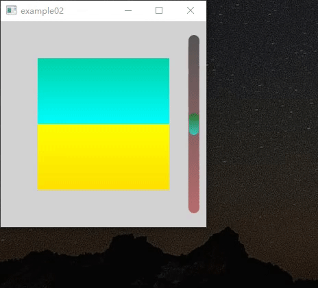
今天弄了一个实例,当我们拖动滑块的时候,黄绿颜色也会随着拖动而变化。在此中用到了 Gradient颜色渐变、drag实现了滑块、transform的平移、ITem属性的clip,最难处理的是,当长宽变化后,如何去保持滑块和颜色比列不变(小菜鸟的自以为)当然再怎么描述也不如仔细瞅一瞅~
( 说个题外话,CSDN不方便传视频,但可以转gif再传,这个MP4转GIF的在线网站超好用 )
共有两个QML文件,一个是主文件SliderMain.qml,它实例化了另外一个颜色变化的ColorRect.qml,且实现了滑块的逻辑。SliderMain.qml如下:
import QtQuick 2.2
import QtQuick.Window 2.1
Window {
property int _pix: 16
property int _margin: 10
property real _defaultSilderValue
property int oldHeight: container.height;
width: 300; height: 300
visible: true;
Rectangle {
anchors.fill: parent;
color: "lightGray"
//1、 实例化了ColorRect.qml文件,且传入了要平移的value。
ColorRect {
id: colorRect
anchors.centerIn: parent
//[重点1]: 因为需要小滑块处于正中间,且正中间的值为0
value : slider.y - _defaultSilderValue;
}
//2、 滑块条的实现
Rectangle {
id: container
anchors {
top: parent.top;
topMargin: _margin * 2;
bottom: parent.bottom;
bottomMargin: _margin *2;
right: parent.right;
rightMargin: _margin
}
width: _pix
radius: width/2;
opacity: 0.6 //不透明度
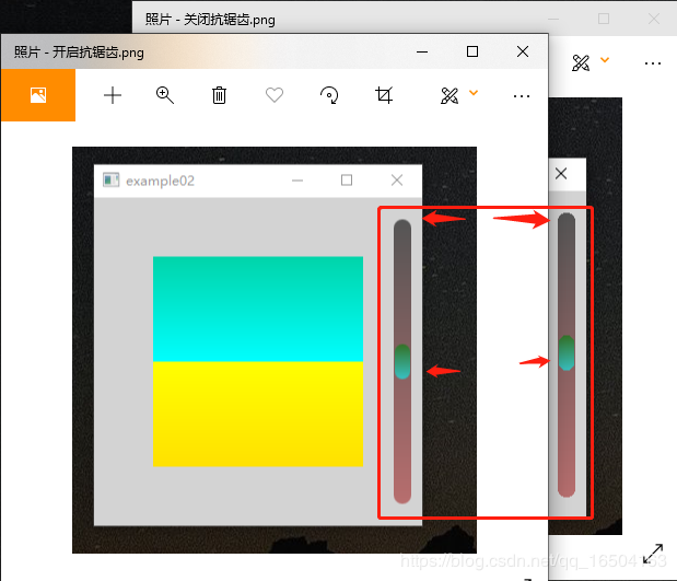
antialiasing: true // 抗锯齿,具体效果见下面图片
//黑色——>棕色的渐变
gradient: Gradient {
GradientStop { position: 0.0; color: "black" }
GradientStop { position: 1.0; color: "brown" }
}
//[重点2]:当面板放大放小的时候,需要保持滑块的比例不变
onHeightChanged: {
if(height <= slider.height){ //当缩小的太小的时候,可以把小滑块也跟着变小
slider.height = height; //小滑块高度 = 滑道高度
}
else {
slider.height = _pix*2; //小滑块高度 = 固定高度
var _scale = (height - _pix*2) / (oldHeight - _pix*2)
//比列尺 * 之前的实际距离
slider.y = slider.y * _scale;
oldHeight = height;
//[重点3]默认中间值,也会随着长宽拖动而变化的。
_defaultSilderValue = height/2-_pix;
}
}
//小滑块条
Rectangle {
id: slider
x: 1; y: container.height/2-_pix; //y轴向向下为负, 默认滑块放中间
width: _pix-2; height: _pix*2 ;
radius: width/2;
antialiasing: true
gradient: Gradient {
GradientStop { position: 0.0; color: "green" }
GradientStop { position: 1.0; color: "aqua" }
}
MouseArea {
anchors.fill: parent
anchors.margins: -_pix
drag.target: parent;
drag.axis: Drag.YAxis
drag.minimumY: 1;
drag.maximumY: container.height - slider.height-1;
}
}
}
}
}
具体的解释,看注释就好了,重要的部分用 “[重点x]” 标记了,注释直接加在代码上才更香嘛。下面是ColorRect.qml 颜色文件的实现:
import QtQuick 2.3
Item {
    property real value;
    id: root
    //[重点1]:clip, 当元素的子项超出父项范围后会自动裁剪,也就是子项超出了范围就剪切掉,不让他显示和起作用
    //在此中,限定在距离parent的54的范围内,默认为false
    clip:           true
    anchors.fill:   parent
    anchors.margins: 54;
    Item {
        width:  root.width
        height: root.height * 3; //高一点,不然上下颜色会被移没去...
        anchors.centerIn: parent
        Rectangle {
            id: _top
            anchors.fill: parent
            smooth: true
            antialiasing: true
            gradient: Gradient {
                GradientStop { position: 0; color: "green" }
                GradientStop { position: 0.5;  color: "aqua" }
            }
        }
        Rectangle {
            id: _bottom
            height: _top.height / 2
            anchors {
                left:   _top.left;
                right:  _top.right;
                bottom: _top.bottom
            }
            smooth: true
            antialiasing: true
            gradient: Gradient {
                GradientStop { position: 0.0;  color: "yellow"  }
                GradientStop { position: 1; color: "orange" }
            }
        }
        //蓝绿面板的上下平移
        transform: Translate{
            y:  value         //Y轴方向的偏移量
        }
    }
}
恩,就只有这两个文件,参考了下官网的实例,QT Creat 欢迎中搜“dial control”,它是拖动滑块实现了仪表盘的旋转。
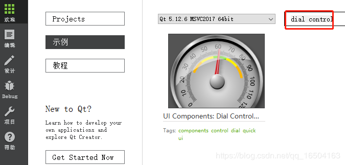
它的演示如下

核心代码代码在此,transform的对象是Rotation ,并对角度设计了个弹簧动画,之前已经学过了弹簧动画了QT Quick QML 动画——SpringAnimation弹簧动画和Behavior
Image {
     id: needle
     x: 98; y: 33
     antialiasing: true
     source: "needle.png"
     transform: Rotation {
         id: needleRotation
         origin.x: 5; origin.y: 65
         //! [needle angle]
         angle: Math.min(Math.max(-130, root.value*2.6 - 130), 133)
         Behavior on angle {
             SpringAnimation {
                 spring: 1.4
                 damping: .15
             }
         }
         //! [needle angle]
     }
 }
● 抗锯齿(antialiasing)
再补充下抗锯齿的表现,开了抗锯齿,效果明显,可能性能下降吧,但是小程序在乎这点性能吗,建议开启。左图是开启了抗锯齿。
● 我的QT QUICK QML学习过程总结:
QT Quick QML入门笔记(一)应用程序结构分析和QML基础
QT Quick QML入门笔记(二)信号与槽
QT Quick QML入门笔记(三)常见元素
QT Quick QML入门笔记(四)锚(anchors)布局
QT Quick QML入门笔记(五)处理鼠标和键盘事件
QT Quick QML 事件处理——定时器
QT Quick QML 动画——SpringAnimation弹簧动画和Behavior
Qt Quick Qml 之QML与C++ 混合编程学习
QT Quick QML 布局——定位置布局(Row、Column、Grid、Flow和Repeater)
QT Quick Qml 之property alias别名使用(Column和Repeater升级版本)
● 不过还是建议您看安神的QT Quick专栏:Qt Quick简明教程
作者:成吉尼古拉斯晗