Vue前端项目自适应布局的简单方法
目录
一、单位尺寸
二、基于rem实现自适应布局
附:html5页面 的rem 布局适配方法
总结
一、单位尺寸px
%
vw、vh: 窗口
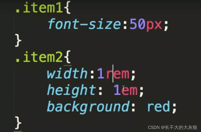
em: 针对父元素的font-size
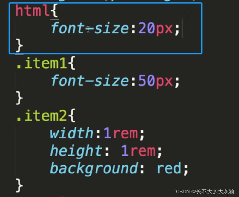
rem:“root em”的缩写,是一个相对长度单位;rem单位作用于非根元素时,相对于根元素(html)字体大小,rem单位作用于根元素字体大小时,相对于其出初始字体大小。
说明:
谷歌浏览器,字体的默认大小是16px;
如果父元素item1的font-size=50px,那么子元素item2的1em=50px。
如果html的顶层font-size为20px; 那么子元素item2的1rem就为20px。
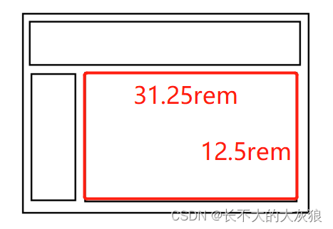
假设页面的根元素,font-size的大小没有设置,默认为16px。
经过设计,我们的页面主体部分宽为500px; 高为200px。要想转换为自适应布局,我们只需要将px转换为rem就可以。

转换后:
宽为:500/16rem
高为:200/16rem
rem 布局适配方案
主要方法为:
按照设计稿与设备宽度的比例,动态计算并设置 html 根标签的 font-size 大小;
css 中,设计稿元素的宽、高、相对位置等取值,按照同等比例换算为 rem 为单位的值;
设计稿中的字体使用 px 为单位,通过媒体查询稍作调整。
1 动态设置 html 标签 font-size 大小
精简通用版本:
!(function(win, doc){
  function setFontSize() {
    // 获取window 宽度
    // zepto实现 $(window).width()就是这么干的
    var winWidth =  window.innerWidth;
    // doc.documentElement.style.fontSize = (winWidth / 640) * 100 + 'px' ;
    // 640宽度以上进行限制 需要css进行配合
    var size = (winWidth / 640) * 100;
    doc.documentElement.style.fontSize = (size < 100 ? size : 100) + 'px' ;
  }
  var evt = 'onorientationchange' in win ? 'orientationchange' : 'resize';
  var timer = null;
  win.addEventListener(evt, function () {
    clearTimeout(timer);
    timer = setTimeout(setFontSize, 300);
  }, false);
  win.addEventListener("pageshow", function(e) {
    if (e.persisted) {
      clearTimeout(timer);
      timer = setTimeout(setFontSize, 300);
    }
  }, false);
  // 初始化
  setFontSize();
}(window, document));
高配精确版本:
(function(WIN) {
    var  setFontSize = WIN.setFontSize = function (_width) {
        var  docEl = document.documentElement;
        // 获取当前窗口的宽度
        var  width = _width || docEl.clientWidth; // docEl.getBoundingClientRect().width;
        // 大于 1080px 按 1080
        if (width > 1080) {
            width = 1080;
        }
        var  rem = width / 10;
        console.log(rem);
        docEl.style.fontSize = rem + 'px';
        // 误差、兼容性处理
        var  actualSize = win.getComputedStyle && parseFloat(win.getComputedStyle(docEl)["font-size"]);
        if (actualSize !== rem && actualSize > 0 && Math.abs(actualSize - rem) > 1) {
            var remScaled = rem * rem / actualSize;
            docEl.style.fontSize = remScaled + 'px';
        }
    }
    var timer;
    function dbcRefresh() {
        clearTimeout(timer);
        timer = setTimeout(setFontSize, 100);
    }
    //窗口更新动态改变 font-size
    WIN.addEventListener('resize', dbcRefresh, false);
    //页面显示时计算一次
    WIN.addEventListener('pageshow', function(e) {
        if (e.persisted) {
            dbcRefresh()
        }
    }, false);
    setFontSize();
})(window)
//对H5活动推过页面,宽高比例有所要求,可适当调整
function adjustWarp(warpId = '#warp') {
    const $win = $(window);
    const height = $win.height();
    let width = $win.width();
    // 考虑导航栏情况
    if (width / height < 360 / 600) {
        return;
    }
    width = Math.ceil(height * 360 / 640);
    $(warpId).css({
        height,
        width,
        postion: 'relative',
        top: 0,
        left: 'auto',
        margin: '0 auto'
    });
    // 重新计算 rem
    window.setFontSize(width);
}
2 通过 CSS3媒体查询设置 rem
简单易用 缺乏灵活度 请看demo 你懂的
@media screen and ( min-width: 320px){html{font-size:50px}}
@media screen and ( min-width: 360px){html{font-size:56.25px}}
@media screen and ( min-width: 375px){html{font-size:58.59375px}}
@media screen and ( min-width: 384px){html{font-size:60px}}
@media screen and ( min-width: 400px){html{font-size:62.5px}}
@media screen and ( min-width: 414px){html{font-size:64.6875px}}
@media screen and ( min-width: 424px){html{font-size:66.25px}}
@media screen and ( min-width: 480px){html{font-size:75px}}
@media screen and ( min-width: 540px){html{font-size:84.375px}}
@media screen and ( min-width: 640px){html{font-size:100px}}
根据个人项目需求和产品设计可适当修改,以上demo写法并不唯一固定。
总结到此这篇关于Vue前端项目自适应布局的文章就介绍到这了,更多相关Vue前端自适应布局内容请搜索软件开发网以前的文章或继续浏览下面的相关文章希望大家以后多多支持软件开发网!
相关文章
Ada
2020-04-07
Serwa
2020-03-20
Claire
2021-05-21
Rhoda
2023-07-22
Hester
2023-07-22
Grace
2023-07-22
Vanna
2023-07-22
Peony
2023-07-22
Dorothy
2023-07-22
Dulcea
2023-07-22
Zandra
2023-07-22
Serafina
2023-07-24
Kathy
2023-08-08
Olivia
2023-08-08
Victoria
2023-08-08
Elina
2023-08-08
Jacinthe
2023-08-08
Viridis
2023-08-08
Hana
2023-08-08