利用python画出AUC曲线的实例
以load_breast_cancer数据集为例,模型细节不重要,重点是画AUC的代码。
直接上代码:
from sklearn.datasets import load_breast_cancer
from sklearn import metrics
from sklearn.ensemble import RandomForestClassifier
from sklearn.model_selection import train_test_split
import pylab as plt
import warnings;warnings.filterwarnings('ignore')
dataset = load_breast_cancer()
data = dataset.data
target = dataset.target
X_train,X_test,y_train,y_test = train_test_split(data,target,test_size=0.2)
rf = RandomForestClassifier(n_estimators=5)
rf.fit(X_train,y_train)
pred = rf.predict_proba(X_test)[:,1]
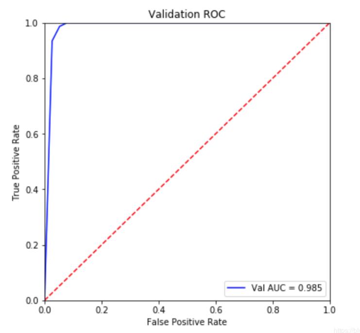
#############画图部分
fpr, tpr, threshold = metrics.roc_curve(y_test, pred)
roc_auc = metrics.auc(fpr, tpr)
plt.figure(figsize=(6,6))
plt.title('Validation ROC')
plt.plot(fpr, tpr, 'b', label = 'Val AUC = %0.3f' % roc_auc)
plt.legend(loc = 'lower right')
plt.plot([0, 1], [0, 1],'r--')
plt.xlim([0, 1])
plt.ylim([0, 1])
plt.ylabel('True Positive Rate')
plt.xlabel('False Positive Rate')
plt.show()
补充拓展:Python机器学习中的roc_auc曲线绘制
废话不多说,直接上代码
from sklearn.metrics import roc_curve,auc
from sklearn.ensemble import RandomForestClassifier
import matplotlib.pyplot as plt
from sklearn.model_selection import train_test_split
x_train,y_train,x_test,y_test=train_test_split(x,y,test_size=0.2)
rf=RandomForestClassifier()
rf.fit(x_train,y_train)
rf.score(x_train,y_train)
print('trainscore:'+str(rfbest.score(x_train,y_train)))
print('testscore:'+str(rfbest.score(x_test,y_test)))
y_score=rfbest.fit(x_train,y_train).predict_proba(x_test) #descision_function()不可用
print(type(y_score))
fpr,tpr,threshold=roc_curve(y_test,y_score[:, 1])
roc_auc=auc(fpr,tpr)
plt.figure(figsize=(10,10))
plt.plot(fpr, tpr, color='darkorange',
lw=2, label='ROC curve (area = %0.2f)' % roc_auc) ###假正率为横坐标,真正率为纵坐标做曲线
plt.plot([0, 1], [0, 1], color='navy', lw=2, linestyle='--')
plt.xlim([0.0, 1.0])
plt.ylim([0.0, 1.05])
plt.xlabel('False Positive Rate')
plt.ylabel('True Positive Rate')
plt.title('Receiver operating characteristic example')
plt.legend(loc="lower right")
plt.show()
以上这篇利用python画出AUC曲线的实例就是小编分享给大家的全部内容了,希望能给大家一个参考,也希望大家多多支持软件开发网。
您可能感兴趣的文章:AUC计算方法与Python实现代码python计算auc指标实例利用Python画ROC曲线和AUC值计算