python绘制堆叠条形图介绍
目前在网络上多是单个条形图堆叠,没看到一组的条形图堆叠。
代码如下:
import numpy as np
import pandas as pd
import matplotlib.pyplot as plt
import matplotlib.ticker as ticker
导入一组自己造的数据
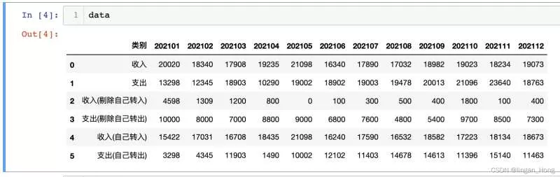
data  = pd.read_excel('data.xlsx')
In [4]: data
Out[4]:
多使用几个plt.bar()函数,就可以画出来啦。。。
tick_label = list(data.columns)
tick_label.remove(‘类别')
x = np.arange(len(tick_label))
y1 = data.iloc[2,1:].values.tolist() #收入(剔除自己转入)
y2 = data.iloc[3,1:].values.tolist() #支出(剔除自己转入)
y3 = data.iloc[4,1:].values.tolist() #收入(自己转入)
y4 = data.iloc[5,1:].values.tolist() #支出(自己转入)
bar_with = 0.25 #柱体宽度plt.figure(figsize = (12,6)) #画布大小
plt.bar(x, y1, width = bar_with, #柱体宽度
align = ‘center', #x轴上的坐标与柱体对其的位置
color = ‘orangered', alpha = 0.6, #柱体透明度
label = ‘收入(剔除自己转入)')
plt.bar(x,y3,width = bar_with, bottom = y1, #柱体基线的y轴坐标
align = ‘center', color = ‘lightsalmon', alpha = 0.6, label = ‘收入(自己转入)')
plt.bar(x + bar_with, y2, width = bar_with,
align = ‘center', color = ‘deepskyblue', alpha = 0.6, label = ‘支出(剔除自己转入)')
plt.bar(x + bar_with, y4, width = bar_with, bottom = y2,
align = ‘center', color = ‘lightskyblue', alpha = 0.6, label = ‘支出(自己转入)')
plt.title(‘月度收支表', fontsize = 10) #设置x轴标题
plt.xticks(x + bar_with/2, tick_label, rotation = 70) #设置x轴坐标
plt.xlabel(‘时间',fontsize = 8, verticalalignment = ‘top', horizontalalignment=‘right',rotation=‘horizontal')
plt.xlabel(‘时间',fontsize = 8, verticalalignment = ‘bottom', horizontalalignment=‘center')
#图例设在图形外面,控制坐标参数
plt.legend(loc = ‘center', bbox_to_anchor = (0.77, 1.1), ncol=2)
plt.savefig(‘draw_bar.png', dpi=200, bbox_inches = ‘tight')
plt.close()
绘制如图:
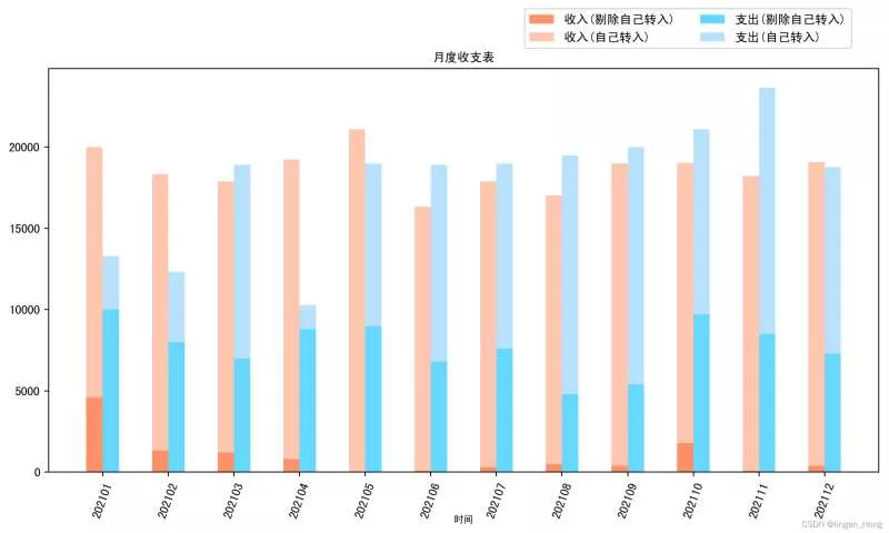
是不是其实plt绘图也没有哪么辣眼睛了。。。
到此这篇关于python绘制堆叠条形图介绍的文章就介绍到这了,更多相关python堆叠条形图内容请搜索软件开发网以前的文章或继续浏览下面的相关文章希望大家以后多多支持软件开发网!