数据分析案例--红酒数据集分析
介绍:
这篇文章主分析了红酒的通用数据集,这个数据集一共有1600个样本,11个红酒的理化性质,以及红酒的品质(评分从0到10)。这里主要用python进行分析,主要内容分为:单变量,双变量,和多变量分析。
注意:我们在分析数据之前,一定要先了解数据。
1.导入python中相关的库
import numpy as np
import pandas as pd
import matplotlib.pyplot as plt
%matplotlib inline
import seaborn as sns
# 颜色
color = sns.color_palette()
# 数据print精度
pd.set_option('precision',3)
2.读取数据
注意:读取数据之前应该先看一下数据文件的格式,再进行读取
 我们看到这个数据使用‘;’进行分隔的,所以我们用‘;’进行分隔读取
pandas.read_csv(filepath, sep=’, ’ ,header=‘infer’, names=None)
filepath:文本文件路径;sep:分隔符;header默认使用第一行作为列名,如果header=None则pandas为其分配默认的列名;也可使用names传入列表指定列名
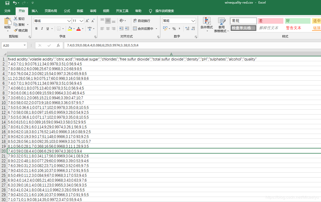
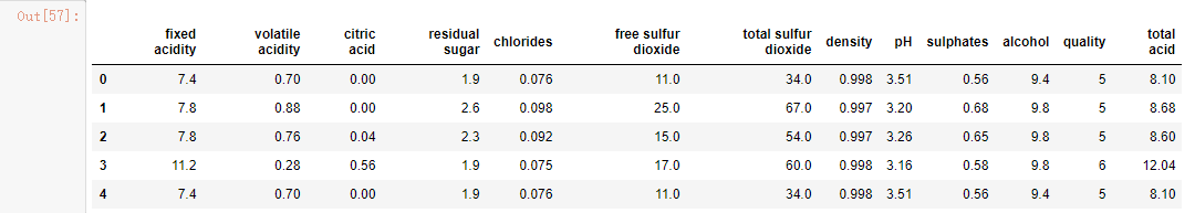
data=pd.read_csv(r'H:\阿里云\红酒数据集分析\winequality-red.csv',sep=';')
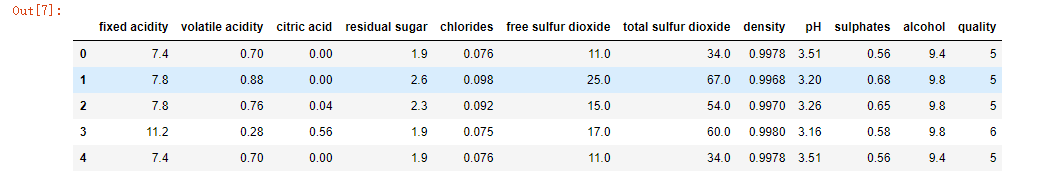
data.head()
先读取数据的前五行
然后我们也可以把这个整理好的数据,再另存为csv文件或者excel文件
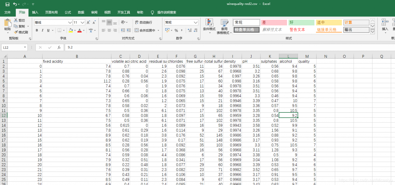
data.to_csv(r'H:\阿里云\红酒数据集分析\winequality-red2.csv')
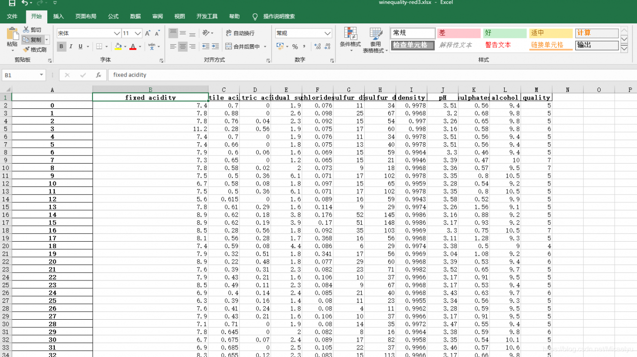
data.to_excel(r'H:\阿里云\红酒数据集分析\winequality-red3.xlsx')
winequality-red2.csv如图:
 winequality-red3.xlsx如图:
 这样呢,我们就保存好了文件。这也是整理文件的一种方式
3.查看数据集的数据类型和空值情况等
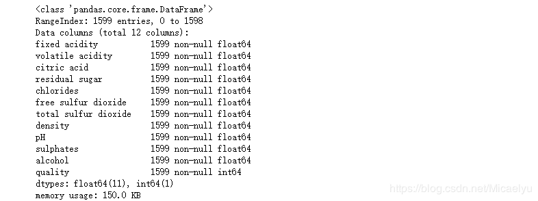
可以看出没有缺失值,数据整齐
4.单变量分析
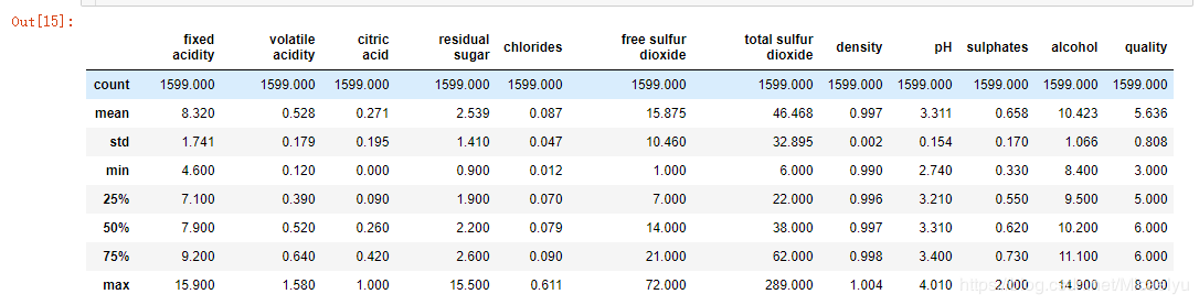
#简单的数据统计
data.describe()
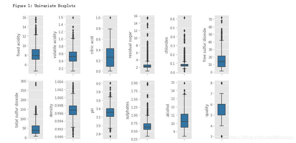
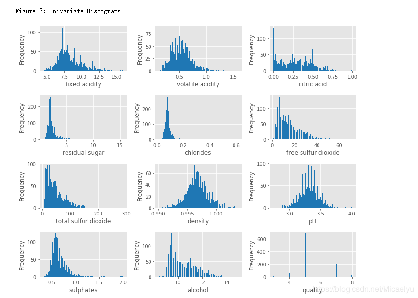
5.绘图
# 获取所有的自带样式
plt.style.available
# 使用自带的样式进行美化
plt.style.use('ggplot')
#获取所有列索引,并且转化成列表格式
colnm = data.columns.tolist()
fig = plt.figure(figsize = (10, 6))
for i in range(12):
    #绘制成2行6列的图
    plt.subplot(2,6,i+1)
    #绘制箱型图
    #Y轴标题
    sns.boxplot(data[colnm[i]], orient="v", width = 0.5, color = color[0])
    plt.ylabel(colnm[i],fontsize = 12)
#plt.subplots_adjust(left=0.2, wspace=0.8, top=0.9)
plt.tight_layout()
print('\nFigure 1: Univariate Boxplots')
colnm = data.columns.tolist()
plt.figure(figsize = (10, 8))
for i in range(12):
    plt.subplot(4,3,i+1)
    #data.hist绘制直方图
    data[colnm[i]].hist(bins = 100, color = color[0])
    plt.xlabel(colnm[i],fontsize = 12)
    plt.ylabel('Frequency')
plt.tight_layout()
print('\nFigure 2: Univariate Histograms')
品质
这个数据集的目的是研究红酒品质和理化性质之间的关系,品质的评价范围是0-10,这个数据集中的范围是3到8,有82%的红酒品质是5或6
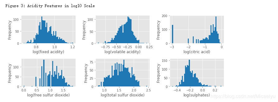
酸度相关的特征
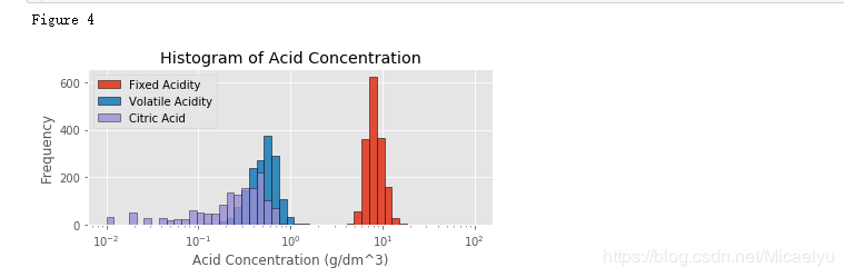
这个数据集有7个酸度相关的特征:fixed acidity, volatile acidity, citric acid, free sulfur dioxide, total sulfur dioxide, sulphates, pH。前6个特征都与红酒的pH的相关。pH是在对数的尺度,下面对前6个特征取对数然后作histogram。另外,pH值主要是与fixed acidity有关fixed acidity比volatile acidity和citric acid高1到2个数量级(Figure 4),比free sulfur dioxide, total sulfur dioxide,sulphates高3个数量级。一个新特征total acid来自于前三个特征的和
acidityFeat = ['fixed acidity', 'volatile acidity', 'citric acid',
'free sulfur dioxide', 'total sulfur dioxide', 'sulphates']
plt.figure(figsize = (10, 4))
for i in range(6):
ax = plt.subplot(2,3,i+1)
#np.log10是以10为底数,clip函数:限制一个array的上下界
v = np.log10(np.clip(data[acidityFeat[i]].values, a_min = 0.001, a_max = None))
plt.hist(v, bins = 50, color = color[0])
plt.xlabel('log(' + acidityFeat[i] + ')',fontsize = 12)
plt.ylabel('Frequency')
plt.tight_layout()
print('\nFigure 3: Acidity Features in log10 Scale')
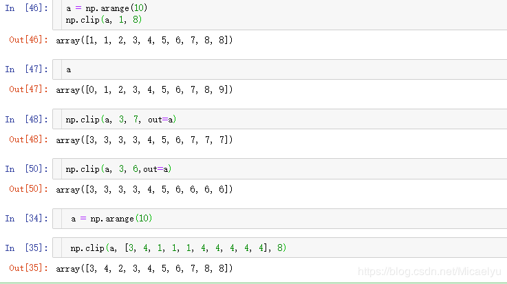
# numpy.clip(a, a_min, a_max, out=None)
# a : array
# a_min : 要限定范围的最小值
# a_max : 要限定范围的最大值
# out : 要输出的array,默认值为None,也可以是原array
插入一个小实验np.log这个函数
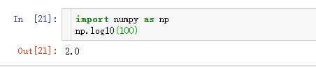
插入一个小实验np.clip()
numpy.clip(a, a_min, a_max, out=None)
a : array
a_min : 要限定范围的最小值
a_max : 要限定范围的最大值
out : 要输出的array,默认值为None,也可以是原array
给定一个范围[min, max],数组中值不在这个范围内的,会被限定为这个范围的边界。如给定范围[0, 1],数组中元素值
小于0的,值会变为0,数组中元素值大于1的,要被更改为1.
plt.figure(figsize=(6,3))
bins = 10**(np.linspace(-2, 2))
plt.hist(data['fixed acidity'], bins = bins, edgecolor = 'k', label = 'Fixed Acidity')
plt.hist(data['volatile acidity'], bins = bins, edgecolor = 'k', label = 'Volatile Acidity')
plt.hist(data['citric acid'], bins = bins, edgecolor = 'k', alpha = 0.8, label = 'Citric Acid')
plt.xscale('log')
plt.xlabel('Acid Concentration (g/dm^3)')
plt.ylabel('Frequency')
plt.title('Histogram of Acid Concentration')
plt.legend()
plt.tight_layout()
print('Figure 4')
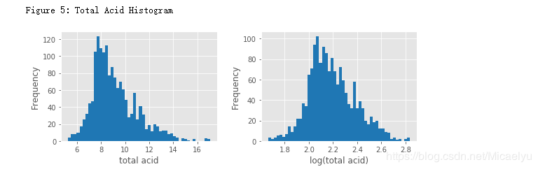
6.总酸度
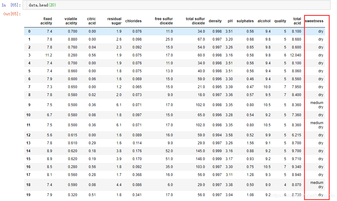
data['total acid'] = data['fixed acidity'] + data['volatile acidity'] + data['citric acid']
data.head()
绘图
plt.figure(figsize = (8,3))
plt.subplot(121)
plt.hist(data['total acid'], bins = 50, color = color[0])
plt.xlabel('total acid')
plt.ylabel('Frequency')
plt.subplot(122)
plt.hist(np.log(data['total acid']), bins = 50 , color = color[0])
plt.xlabel('log(total acid)')
plt.ylabel('Frequency')
plt.tight_layout()
print("Figure 5: Total Acid Histogram")
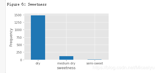
甜度(sweetness)
Residual sugar 与酒的甜度相关,通常用来区别各种红酒,干红(45g/L)。
这个数据中,主要为干红,没有甜葡萄酒
# Residual sugar
data['sweetness'] = pd.cut(data['residual sugar'], bins = [0, 4, 12, 45], labels=["dry", "medium dry", "semi-sweet"])
plt.figure(figsize = (5,3))
data['sweetness'].value_counts().plot(kind = 'bar', color = color[0])
plt.xticks(rotation=0)
plt.xlabel('sweetness', fontsize = 12)
plt.ylabel('Frequency', fontsize = 12)
plt.tight_layout()##自动调整子图参数,使之填充整个图像区域
print("Figure 6: Sweetness")
7.双变量分析
红酒品质和理论化特征的关系
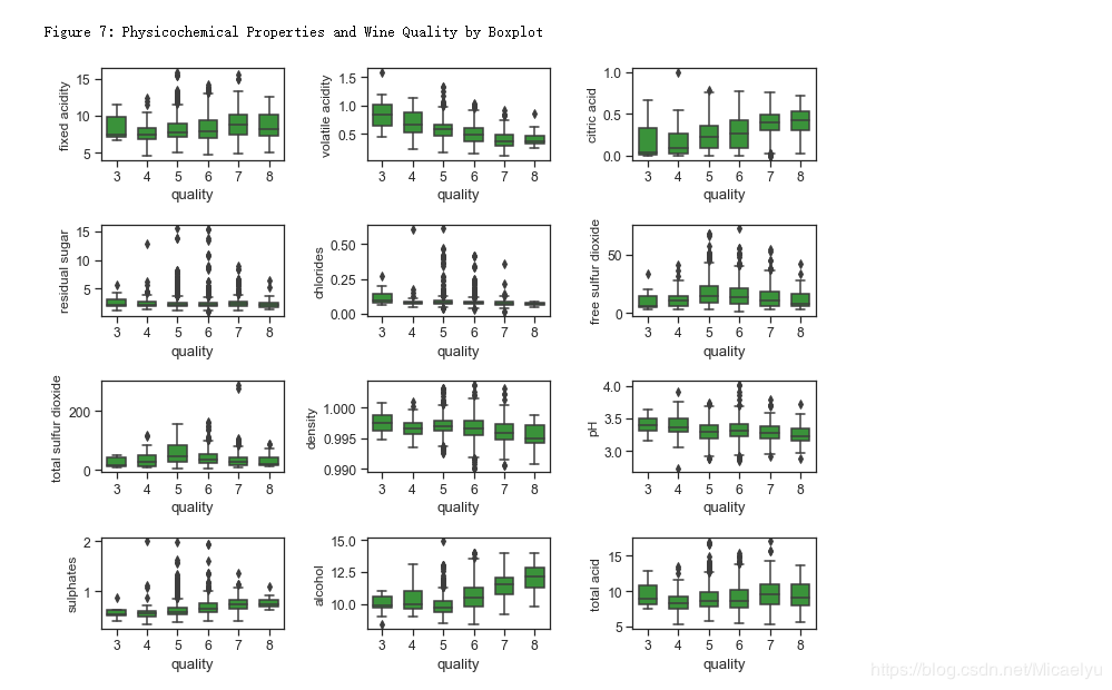
下面Figure 7和8分别显示了红酒理化特征和品质的关系。其中可以看出的趋势有:
(1)品质好的酒有更高的柠檬酸,硫酸盐,和酒精度数。硫酸盐(硫酸钙)的加入通常是调整酒的酸度的。其中酒精度数和品质的相关性最高。
(2)品质好的酒有较低的挥发性酸类,密度,和pH。
(3)残留糖分,氯离子,二氧化硫似乎对酒的品质影响不大。
sns.set_style('ticks')
sns.set_context("notebook", font_scale= 1.1)
colnm = data.columns.tolist()[:11] + ['total acid']
plt.figure(figsize = (10, 8))
for i in range(12):
    plt.subplot(4,3,i+1)
    sns.boxplot(x ='quality', y = colnm[i], data = data, color = color[2], width = 0.6)
    plt.ylabel(colnm[i],fontsize = 12)
plt.tight_layout()
print("\nFigure 7: Physicochemical Properties and Wine Quality by Boxplot")
sns.set_style("dark")
plt.figure(figsize = (10,8))
colnm = data.columns.tolist()[:11] + ['total acid', 'quality']
mcorr = data[colnm].corr()
mask = np.zeros_like(mcorr, dtype=np.bool)
mask[np.triu_indices_from(mask)] = True
cmap = sns.diverging_palette(220, 10, as_cmap=True)
g = sns.heatmap(mcorr, mask=mask, cmap=cmap, square=True, annot=True, fmt='0.2f')
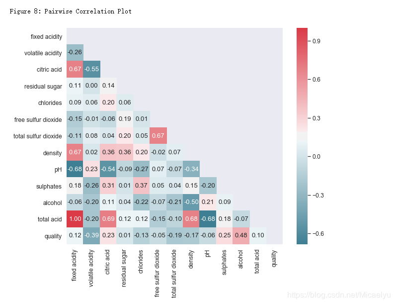
print("\nFigure 8: Pairwise Correlation Plot")
8.密度和酒精浓度
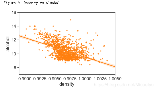
密度和酒精浓度是相关的,物理上,两者并不是线性关系。Figure 8展示了两者的关系。另外密度还与酒中其他物质的含量有关,但是关系很小。
sns.set_style('ticks')
sns.set_context("notebook", font_scale= 1.4)
# plot figure
plt.figure(figsize = (6,4))
sns.regplot(x='density', y = 'alcohol', data = data, scatter_kws = {'s':10}, color = color[1])
plt.xlim(0.989, 1.005)
plt.ylim(7,16)
print('Figure 9: Density vs Alcohol')
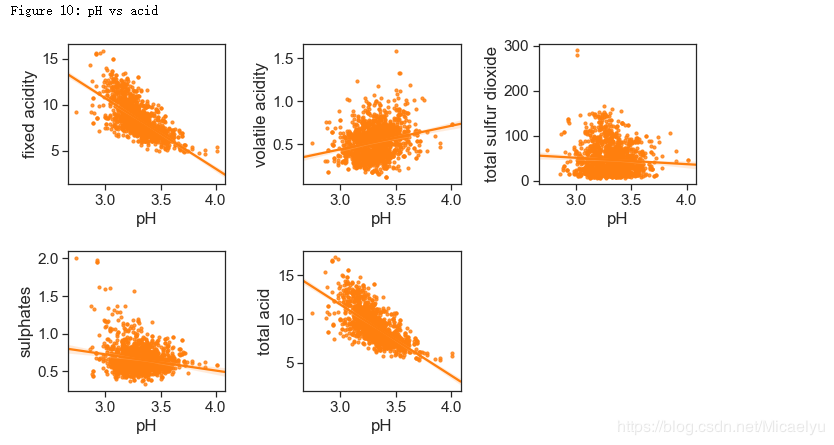
酸性物质含量和pH
H和非挥发性酸性物质有-0.683的相关性。因为非挥发性酸性物质的含量远远高于其他酸性物质,总酸性物质(total acidity)这个特征并没有太多意义。
acidity_related = ['fixed acidity', 'volatile acidity', 'total sulfur dioxide',
                   'sulphates', 'total acid']
plt.figure(figsize = (10,6))
for i in range(5):
    plt.subplot(2,3,i+1)
    sns.regplot(x='pH', y = acidity_related[i], data = data, scatter_kws = {'s':10}, color = color[1])
plt.tight_layout()
print("Figure 10: pH vs acid")
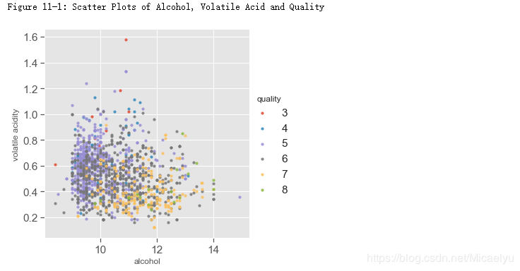
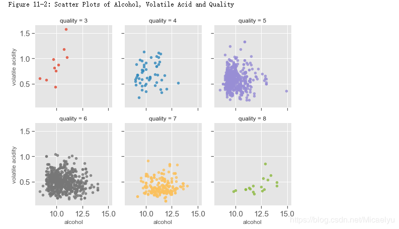
9.多变量分析
与品质相关性最高的三个特征是酒精浓度,挥发性酸度,和柠檬酸。下面图中显示的酒精浓度,挥发性酸和品质的关系。
酒精浓度,挥发性酸和品质
对于好酒(7,8)以及差酒(3,4),关系很明显。但是对于中等酒(5,6),酒精浓度的挥发性酸度有很大程度的交叉
plt.style.use('ggplot')
sns.lmplot(x = 'alcohol', y = 'volatile acidity', hue = 'quality',
           data = data, fit_reg = False, scatter_kws={'s':10}, size = 5)
print("Figure 11-1: Scatter Plots of Alcohol, Volatile Acid and Quality")
sns.lmplot(x = 'alcohol', y = 'volatile acidity', col='quality', hue = 'quality',
           data = data,fit_reg = False, size = 3,  aspect = 0.9, col_wrap=3,
           scatter_kws={'s':20})
print("Figure 11-2: Scatter Plots of Alcohol, Volatile Acid and Quality")
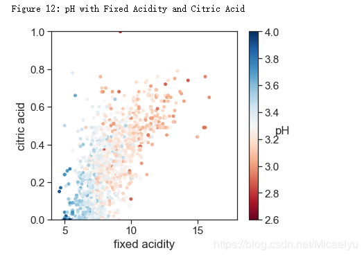
pH,非挥发性酸,和柠檬酸
pH和非挥发性的酸以及柠檬酸有相关性。整体趋势也很合理,即浓度越高,pH越低
# style
sns.set_style('ticks')
sns.set_context("notebook", font_scale= 1.4)
plt.figure(figsize=(6,5))
cm = plt.cm.get_cmap('RdBu')
sc = plt.scatter(data['fixed acidity'], data['citric acid'], c=data['pH'], vmin=2.6, vmax=4, s=15, cmap=cm)
bar = plt.colorbar(sc)
bar.set_label('pH', rotation = 0)
plt.xlabel('fixed acidity')
plt.ylabel('citric acid')
plt.xlim(4,18)
plt.ylim(0,1)
print('Figure 12: pH with Fixed Acidity and Citric Acid')
总结:
整体而言,红酒的品质主要与酒精浓度,挥发性酸,和柠檬酸有关。对于品质优于7,或者劣于4的酒,直观上是线性可分的。但是品质为5,6的酒很难线性区分。
本文代码已上传到github:
https://github.com/michael-wy/data-analysis
原文链接:红酒集数据分析
作者:Micaelyu