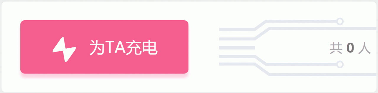
css+svg实现b站充电效果的示例代码
难点
svg图形的两块蒙版制作
先上代码
这是左边粉色框框的内容
这个没啥好说的
<div id="con">
    <div id="TA-con">
      <div id="text-con">
        <div id="linght"></div>
        <div id="TA">为TA充电</div>
      </div>
    </div>
body {
      margin: 0;
      padding: 0;
      background-color: #eee;
    }
    /* 设置白色容器 */
    #con {
      width: 350px;
      height: 85px;
      background-color: #fff;
      position: relative;
      border-radius: 4px;
      margin:50px auto;
    }
#TA-con {
      width: 157px;
      height: 50px;
      background-color: #f25d8e;
      box-shadow: 0 4px 4px rgba(255, 112, 159, .3);
      position: absolute;
      top: 50%;
      left: 5%;
      transform: translateY(-50%);
      border-radius: 4px;
      cursor: pointer;
    }
    /* 设置文本居中容器 */
    #text-con {
      width: 100px;
      height: 100%;
      margin: 0 auto;
      position: relative;
    }
    /* 做一个小闪电 */
    #linght {
      width: 0;
      height: 0;
      position: absolute;
      top: 36%;
      left: 4px;
      border-color: transparent;
      border-style: solid;
      border-width: 10px;
      border-top: 10px solid #fff;
      border-radius: 4px;
      transform: rotate(-55deg);
    }
    #linght::after {
      position: absolute;
      top: -13px;
      left: -11px;
      content: "";
      width: 0;
      height: 0;
      border-color: transparent;
      border-style: solid;
      border-width: 10px;
      border-top: 10px solid #fff;
      transform: rotate(180deg);
      border-radius: 4px;
    }
    /* 文字 */
    #TA {
      float: right;
      line-height: 50px;
      font-size: 15px;
      color: #fff;
    }
    #TA-con:hover {
      background-color: #ff6b9a;
    }
这里做的就是创建一个svg的图形,背景色是灰色,看着是不是很多很复杂,没事,这也不是我写的
 <div id="tube-con">
      <svg viewBox="0 0 1028 385" fill="none" xmlns="http://www.w3.org/2000/svg">
        <path d="M1 77H234.226L307.006 24H790" stroke="#e5e9ef" stroke-width="20" />
        <path d="M0 140H233.035L329.72 71H1028" stroke="#e5e9ef" stroke-width="20" />
        <path d="M1 255H234.226L307.006 307H790" stroke="#e5e9ef" stroke-width="20" />
        <path d="M0 305H233.035L329.72 375H1028" stroke="#e5e9ef" stroke-width="20" />
        <rect y="186" width="236" height="24" fill="#e5e9ef" />
        <ellipse cx="790" cy="25.5" rx="25" ry="25.5" fill="#e5e9ef" />
        <circle r="14" transform="matrix(1 0 0 -1 790 25)" fill="white" />
        <ellipse cx="790" cy="307.5" rx="25" ry="25.5" fill="#e5e9ef" />
        <circle r="14" transform="matrix(1 0 0 -1 790 308)" fill="white" />
      </svg>
用的是这玩意,网页版在线的,画好后就可以右击了,是不是很简单! www.figma.com/
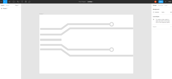
既然svg图画好了,就要想怎么完成了
需要的东西:
1:svg底色为灰色的图;
2:一个粉色的svg图,当我鼠标hover到左边粉色框时,粉色svg图完全展开,初始为0;
3:快速移动的黄色小方块;
底色灰色做好了,还差粉色和黄色的svg图
mask是用来做粉色svg的蒙版的
<div id="mask">
跟灰色svg没有任何的区别,就是改改颜色
<svg viewBox="0 0 1028 385" fill="none" xmlns="http://www.w3.org/2000/svg">
<path d="M1 77H234.226L307.006 24H790" stroke="#f25d8e" stroke-width="20" />
<path d="M0 140H233.035L329.72 71H1028" stroke="#f25d8e" stroke-width="20" />
<path d="M1 255H234.226L307.006 307H790" stroke="#f25d8e" stroke-width="20" />
<path d="M0 305H233.035L329.72 375H1028" stroke="#f25d8e" stroke-width="20" />
<rect y="186" width="236" height="24" fill="#f25d8e" />
<ellipse cx="790" cy="25.5" rx="25" ry="25.5" fill="#f25d8e" />
<circle r="14" transform="matrix(1 0 0 -1 790 25)" fill="white" />
<ellipse cx="790" cy="307.5" rx="25" ry="25.5" fill="#f25d8e" />
<circle r="14" transform="matrix(1 0 0 -1 790 308)" fill="white" />
</svg>
</div>
orange-mask是用来做黄色svg的蒙版
<div id="orange-mask" >
跟灰色svg没有任何的区别,就是改改颜色
<svg viewBox="0 0 1028 385" fill="none" xmlns="http://www.w3.org/2000/svg">
<path d="M1 77H234.226L307.006 24H790" stroke="#ffd52b" stroke-width="20" />
<path d="M0 140H233.035L329.72 71H1028" stroke="#ffd52b" stroke-width="20" />
<path d="M1 255H234.226L307.006 307H790" stroke="#ffd52b" stroke-width="20" />
<path d="M0 305H233.035L329.72 375H1028" stroke="#ffd52b" stroke-width="20" />
<rect y="186" width="236" height="24" fill="#ffd52b" />
<ellipse cx="790" cy="25.5" rx="25" ry="25.5" fill="#ffd52b" />
<circle r="14" transform="matrix(1 0 0 -1 790 25)" fill="white" />
<ellipse cx="790" cy="307.5" rx="25" ry="25.5" fill="#ffd52b" />
<circle r="14" transform="matrix(1 0 0 -1 790 308)" fill="white" />
</svg>
</div>
<p id="people">共 <b>0</b> 人</p>
</div>
</div>
css的代码
/* 创建图形容器 */
    #tube-con {
      width: 157px;
      height: 55px;
      position: absolute;
      right: -5px;
      top: 15px;
    }
    /* 对svg图形设置宽高 */
    svg {
      width: 100%;
      height: 100%;
    }
    /* 创建一个蒙版 宽度为0,当我hover充电框的时候,宽度展开 */
    #mask {
      width: 0px;
      height: 100%;
      overflow: hidden;
      position: absolute;
      top: 0;
      left: 0;
      transition:all 0.5s;
    }
    /* 对蒙版的sbg单独设置宽高,保证宽度高低有一个固定值而不是百分比 */
    #mask svg {
      width: 157px;
      height: 55px;
    }
    /* 对充电框hover的时候开始动画,将粉色线条铺开 */
    #TA-con:hover+#tube-con>#mask{
      width:157px;
    }
    /* 对充电框hover的时候开始动画,添加黄色快速移动的动画 */
    #TA-con:hover+#tube-con>#orange-mask{
      animation: move1 0.5s linear 0.2s infinite;
    }
    #TA-con:hover+#tube-con>#orange-mask svg{
      animation: movetwo 0.5s linear 0.2s infinite;
    }
    /* 创建黄色移动的蒙版 */
    #orange-mask{
      width: 18px;
      height: 100%;
      overflow: hidden;
      position:absolute;
      left:-15px;
      top:0px;
    }
    /* 创建黄色移动的内容 */
    #orange-mask svg {
      position: absolute;;
      top:0;
      left:15px;
      width: 157px;
      height: 55px;
    }
    @keyframes move1 {
      0%{
        left:-15px;
      }
      100%{
        left:140px;
      }
    }
    @keyframes movetwo {
      0%{
        left:15px;
      }
      100%{
        left:-140px;
      }
    }
    #people{
      position:absolute;
      right:10px;
      top:8px;
      font-size:12px;
      font-family:"雅黑";
      color:#aaa;
    }
    #people>b{
      color:#777;
    }
其中css处理最难的地方在于黄色svg和黄色svg蒙版的地方
因为既要保证黄色svg的蒙版从左向右移动,又要保证黄色svg位置保证不变;
蒙版为父元素,黄色svg为子元素,
父元素添加定位后,父元素移动,子元素一定会跟着移动,
如果子元素添加定位,父元素不添加定位 或者 父元素正常定位,子元素定位为fixed,
这有会导致父元素蒙版不能对子元素溢出的部分进行隐藏,在这我纠结了好久
!!!然后我就突然发现
父元素无论以多块的速度移动多远的距离,子元素只要以相同的速度移动相反的距离,
子元素就能保证一直以一个位置保持不变!!!子元素就相对body是静止的!!
move1是父元素蒙版的,movetwo是黄色svg图形的,请不要吐槽起名。。。。
move1移动多远,movetwo就移动相反的距离
 @keyframes move1 {
      0%{
        left:-15px;
      }
      100%{
        left:140px;
      }
    }
    @keyframes movetwo {
      0%{
        left:15px;
      }
      100%{
        left:-140px;
      }
    }
全部的代码
<!DOCTYPE html>
<html lang="en">
<head>
  <meta charset="UTF-8">
  <meta name="viewport" content="width=device-width, initial-scale=1.0">
  <title>Document</title>
  <style>
    body {
      margin: 0;
      padding: 0;
      background-color: #eee;
    }
    /* 设置白色容器 */
    #con {
      width: 350px;
      height: 85px;
      background-color: #fff;
      position: relative;
      border-radius: 4px;
      margin:50px auto;
    }
    /* 设置文本内容容器 */
    #TA-con {
      width: 157px;
      height: 50px;
      background-color: #f25d8e;
      box-shadow: 0 4px 4px rgba(255, 112, 159, .3);
      position: absolute;
      top: 50%;
      left: 5%;
      transform: translateY(-50%);
      border-radius: 4px;
      cursor: pointer;
    }
    /* 设置文本居中容器 */
    #text-con {
      width: 100px;
      height: 100%;
      margin: 0 auto;
      position: relative;
    }
    /* 做一个小闪电 */
    #linght {
      width: 0;
      height: 0;
      position: absolute;
      top: 36%;
      left: 4px;
      border-color: transparent;
      border-style: solid;
      border-width: 10px;
      border-top: 10px solid #fff;
      border-radius: 4px;
      transform: rotate(-55deg);
    }
    #linght::after {
      position: absolute;
      top: -13px;
      left: -11px;
      content: "";
      width: 0;
      height: 0;
      border-color: transparent;
      border-style: solid;
      border-width: 10px;
      border-top: 10px solid #fff;
      transform: rotate(180deg);
      border-radius: 4px;
    }
    /* 文字 */
    #TA {
      float: right;
      line-height: 50px;
      font-size: 15px;
      color: #fff;
    }
    #TA-con:hover {
      background-color: #ff6b9a;
    }
    /* 创建图形容器 */
    #tube-con {
      width: 157px;
      height: 55px;
      position: absolute;
      right: -5px;
      top: 15px;
    }
    /* 对svg图形设置宽高 */
    svg {
      width: 100%;
      height: 100%;
    }
    /* 创建一个蒙版 宽度为0,当我hover充电框的时候,宽度展开 */
    #mask {
      width: 0px;
      height: 100%;
      overflow: hidden;
      position: absolute;
      top: 0;
      left: 0;
      transition:all 0.5s;
    }
    /* 对蒙版的sbg单独设置宽高,保证宽度高低有一个固定值而不是百分比 */
    #mask svg {
      width: 157px;
      height: 55px;
    }
    /* 对充电框hover的时候开始动画,将粉色线条铺开 */
    #TA-con:hover+#tube-con>#mask{
      width:157px;
    }
    /* 对充电框hover的时候开始动画,添加黄色快速移动的动画 */
    #TA-con:hover+#tube-con>#orange-mask{
      animation: move1 0.5s linear 0.2s infinite;
    }
    #TA-con:hover+#tube-con>#orange-mask svg{
      animation: movetwo 0.5s linear 0.2s infinite;
    }
    /* 创建黄色移动的蒙版 */
    #orange-mask{
      width: 18px;
      height: 100%;
      overflow: hidden;
      position:absolute;
      left:-15px;
      top:0px;
    }
    /* 创建黄色移动的内容 */
    #orange-mask svg {
      position: absolute;;
      top:0;
      left:15px;
      width: 157px;
      height: 55px;
    }
    @keyframes move1 {
      0%{
        left:-15px;
      }
      100%{
        left:140px;
      }
    }
    @keyframes movetwo {
      0%{
        left:15px;
      }
      100%{
        left:-140px;
      }
    }
    #people{
      position:absolute;
      right:10px;
      top:8px;
      font-size:12px;
      font-family:"雅黑";
      color:#aaa;
    }
    #people>b{
      color:#777;
    }
  </style>
</head>
<body>
  <div id="con">
    <div id="TA-con">
      <div id="text-con">
        <div id="linght"></div>
        <div id="TA">为TA充电</div>
      </div>
    </div>
    <div id="tube-con">
      <svg viewBox="0 0 1028 385" fill="none" xmlns="http://www.w3.org/2000/svg">
        <path d="M1 77H234.226L307.006 24H790" stroke="#e5e9ef" stroke-width="20" />
        <path d="M0 140H233.035L329.72 71H1028" stroke="#e5e9ef" stroke-width="20" />
        <path d="M1 255H234.226L307.006 307H790" stroke="#e5e9ef" stroke-width="20" />
        <path d="M0 305H233.035L329.72 375H1028" stroke="#e5e9ef" stroke-width="20" />
        <rect y="186" width="236" height="24" fill="#e5e9ef" />
        <ellipse cx="790" cy="25.5" rx="25" ry="25.5" fill="#e5e9ef" />
        <circle r="14" transform="matrix(1 0 0 -1 790 25)" fill="white" />
        <ellipse cx="790" cy="307.5" rx="25" ry="25.5" fill="#e5e9ef" />
        <circle r="14" transform="matrix(1 0 0 -1 790 308)" fill="white" />
      </svg>
      <div id="mask">
        <svg viewBox="0 0 1028 385" fill="none" xmlns="http://www.w3.org/2000/svg">
          <path d="M1 77H234.226L307.006 24H790" stroke="#f25d8e" stroke-width="20" />
          <path d="M0 140H233.035L329.72 71H1028" stroke="#f25d8e" stroke-width="20" />
          <path d="M1 255H234.226L307.006 307H790" stroke="#f25d8e" stroke-width="20" />
          <path d="M0 305H233.035L329.72 375H1028" stroke="#f25d8e" stroke-width="20" />
          <rect y="186" width="236" height="24" fill="#f25d8e" />
          <ellipse cx="790" cy="25.5" rx="25" ry="25.5" fill="#f25d8e" />
          <circle r="14" transform="matrix(1 0 0 -1 790 25)" fill="white" />
          <ellipse cx="790" cy="307.5" rx="25" ry="25.5" fill="#f25d8e" />
          <circle r="14" transform="matrix(1 0 0 -1 790 308)" fill="white" />
        </svg>
      </div>
      <div id="orange-mask" >
        <svg viewBox="0 0 1028 385" fill="none" xmlns="http://www.w3.org/2000/svg">
          <path d="M1 77H234.226L307.006 24H790" stroke="#ffd52b" stroke-width="20" />
          <path d="M0 140H233.035L329.72 71H1028" stroke="#ffd52b" stroke-width="20" />
          <path d="M1 255H234.226L307.006 307H790" stroke="#ffd52b" stroke-width="20" />
          <path d="M0 305H233.035L329.72 375H1028" stroke="#ffd52b" stroke-width="20" />
          <rect y="186" width="236" height="24" fill="#ffd52b" />
          <ellipse cx="790" cy="25.5" rx="25" ry="25.5" fill="#ffd52b" />
          <circle r="14" transform="matrix(1 0 0 -1 790 25)" fill="white" />
          <ellipse cx="790" cy="307.5" rx="25" ry="25.5" fill="#ffd52b" />
          <circle r="14" transform="matrix(1 0 0 -1 790 308)" fill="white" />
        </svg>
      </div>
      <p id="people">共 <b>0</b> 人</p>
    </div>
  </div>
</body>
</html>
到此这篇关于css+svg实现b站充电效果的示例代码的文章就介绍到这了,更多相关css b站充电内容请搜索软件开发网以前的文章或继续浏览下面的相关文章,希望大家以后多多支持软件开发网!