Python可视化神器pyecharts绘制折线图详情
折线图介绍
折线图模板系列
双折线图(气温最高最低温度趋势显示)
面积折线图(紧贴Y轴)
简单折线图(无动态和数据标签)
连接空白数据折线图
对数轴折线图示例
折线图堆叠(适合多个折线图展示)
二维曲线折线图(两个数据)
多维度折线图(颜色对比)
阶梯折线图
js高渲染折线图
折线图介绍折线图和柱状图一样是我们日常可视化最多的一个图例,当然它的优势和适用场景相信大家肯定不陌生,要想快速的得出趋势,抓住趋势二字,就会很快的想到要用折线图来表示了。折线图是通过直线将这些点按照某种顺序连接起来形成的图,适用于数据在一个有序的因变量上的变化,它的特点是反应事物随类别而变化的趋势,可以清晰展现数据的增减趋势、增减的速率、增减的规律、峰值等特征。
优点:
能很好的展现沿某个维度的变化趋势
能比较多组数据在同一个维度上的趋势
适合展现较大数据集
缺点:每张图上不适合展示太多折线
折线图模板系列 双折线图(气温最高最低温度趋势显示)双折线图在一张图里面显示,肯定有一个相同的维度,然后有两个不同的数据集。比如一天的温度有最高的和最低的温度,我们就可以用这个来作为展示了。
import pyecharts.options as opts
from pyecharts.charts import Line
week_name_list = ["周一", "周二", "周三", "周四", "周五", "周六", "周日"]
high_temperature = [11, 11, 15, 13, 12, 13, 10]
low_temperature = [1, -2, 2, 5, 3, 2, 0]
(
Line(init_opts=opts.InitOpts(width="1000px", height="600px"))
.add_xaxis(xaxis_data=week_name_list)
.add_yaxis(
series_name="最高气温",
y_axis=high_temperature,
# 显示最大值和最小值
# markpoint_opts=opts.MarkPointOpts(
# data=[
# opts.MarkPointItem(type_="max", name="最大值"),
# opts.MarkPointItem(type_="min", name="最小值"),
# ]
# ),
# 显示平均值
# markline_opts=opts.MarkLineOpts(
# data=[opts.MarkLineItem(type_="average", name="平均值")]
# ),
)
.add_yaxis(
series_name="最低气温",
y_axis=low_temperature,
# 设置刻度标签
# markpoint_opts=opts.MarkPointOpts(
# data=[opts.MarkPointItem(value=-2, name="周最低", x=1, y=-1.5)]
# ),
# markline_opts=opts.MarkLineOpts(
# data=[
# opts.MarkLineItem(type_="average", name="平均值"),
# opts.MarkLineItem(symbol="none", x="90%", y="max"),
# opts.MarkLineItem(symbol="circle", type_="max", name="最高点"),
# ]
# ),
)
.set_global_opts(
title_opts=opts.TitleOpts(title="未来一周气温变化", subtitle="副标题"),
# tooltip_opts=opts.TooltipOpts(trigger="axis"),
# toolbox_opts=opts.ToolboxOpts(is_show=True),
xaxis_opts=opts.AxisOpts(type_="category", boundary_gap=False),
)
.render("最低最高温度折线图.html")
)
print("图表已生成!请查收!")

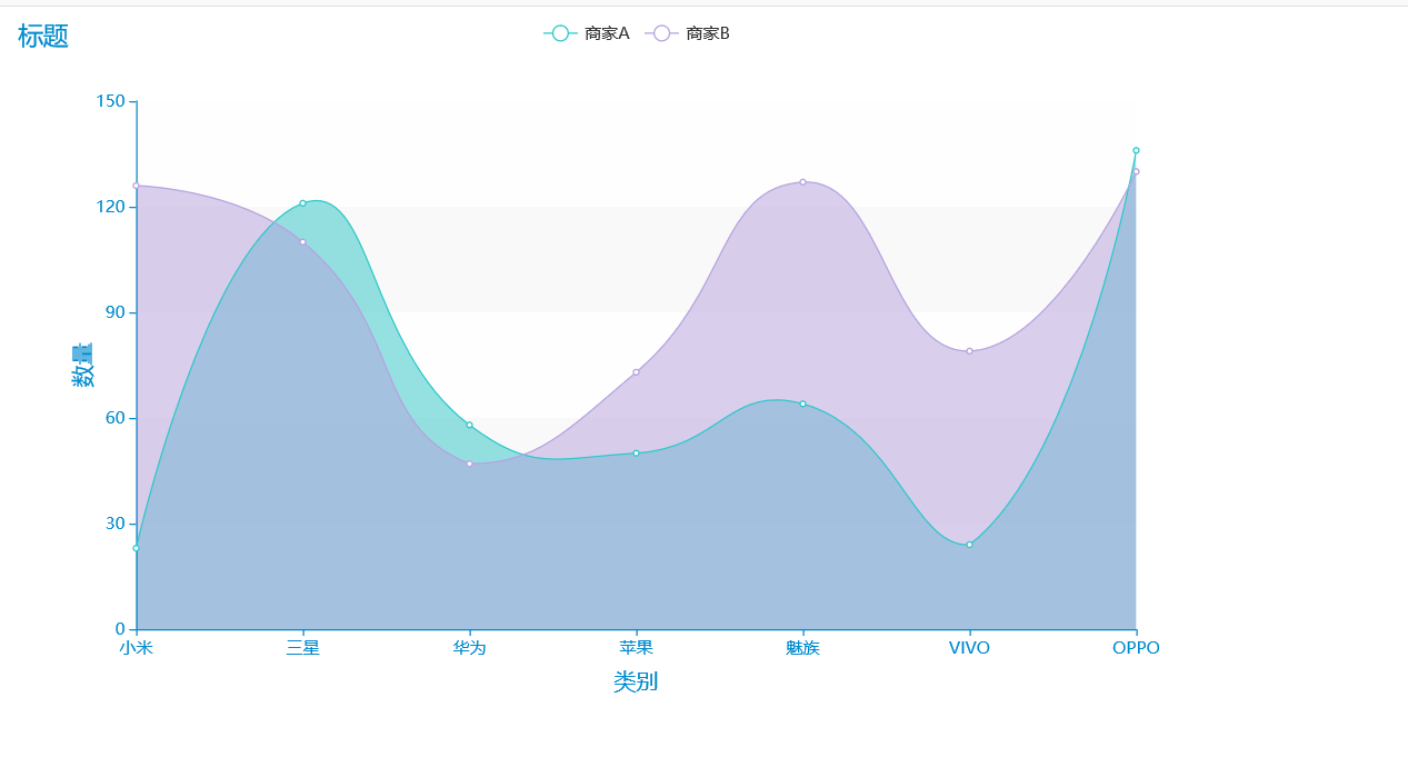
还记得二重积分吗,面积代表什么?有时候我们就想要看谁围出来的面积大,这个在物理的实际运用中比较常见,下面来看看效果吧。
import pyecharts.options as opts
from pyecharts.charts import Line
from pyecharts.faker import Faker
from pyecharts.globals import ThemeType
c = (
Line({"theme": ThemeType.MACARONS})
.add_xaxis(Faker.choose())
.add_yaxis("商家A", Faker.values(), is_smooth=True)
.add_yaxis("商家B", Faker.values(), is_smooth=True)
.set_series_opts(
areastyle_opts=opts.AreaStyleOpts(opacity=0.5),
label_opts=opts.LabelOpts(is_show=False),
)
.set_global_opts(
title_opts=opts.TitleOpts(title="标题"),
xaxis_opts=opts.AxisOpts(
axistick_opts=opts.AxisTickOpts(is_align_with_label=True),
is_scale=False,
boundary_gap=False,
name='类别',
name_location='middle',
name_gap=30, # 标签与轴线之间的距离,默认为20,最好不要设置20
name_textstyle_opts=opts.TextStyleOpts(
font_family='Times New Roman',
font_size=16 # 标签字体大小
)),
yaxis_opts=opts.AxisOpts(
name='数量',
name_location='middle',
name_gap=30,
name_textstyle_opts=opts.TextStyleOpts(
font_family='Times New Roman',
font_size=16
# font_weight='bolder',
)),
# toolbox_opts=opts.ToolboxOpts() # 工具选项
)
.render("面积折线图-紧贴Y轴.html")
)
print("请查收!")
此模板和Excel里面的可视化差不多,没有一点功能元素,虽然它是最简洁的,但是我们可以通过这个进行改动,在上面创作的画作。
import pyecharts.options as opts
from pyecharts.charts import Line
from pyecharts.globals import ThemeType
x_data = ["Mon", "Tue", "Wed", "Thu", "Fri", "Sat", "Sun"]
y_data = [820, 932, 901, 934, 1290, 1330, 1320]
(
Line({"theme": ThemeType.MACARONS})
.set_global_opts(
tooltip_opts=opts.TooltipOpts(is_show=False),
xaxis_opts=opts.AxisOpts(
name='类别',
name_location='middle',
name_gap=30, # 标签与轴线之间的距离,默认为20,最好不要设置20
name_textstyle_opts=opts.TextStyleOpts(
font_family='Times New Roman',
font_size=16 # 标签字体大小
)),
yaxis_opts=opts.AxisOpts(
type_="value",
axistick_opts=opts.AxisTickOpts(is_show=True),
splitline_opts=opts.SplitLineOpts(is_show=True),
name='数量',
name_location='middle',
name_gap=30,
name_textstyle_opts=opts.TextStyleOpts(
font_family='Times New Roman',
font_size=16
# font_weight='bolder',
)),
)
.add_xaxis(xaxis_data=x_data)
.add_yaxis(
series_name="",
y_axis=y_data,
symbol="emptyCircle",
is_symbol_show=True,
label_opts=opts.LabelOpts(is_show=False),
)
.render("简单折线图.html")
)

有时候我们在处理数据的时候,发现有些类别的数据缺失了,这个时候我们想要它可以自动连接起来,那么这个模板就可以用到了。
import pyecharts.options as opts
from pyecharts.charts import Line
from pyecharts.faker import Faker
from pyecharts.globals import ThemeType
y = Faker.values()
y[3], y[5] = None, None
c = (
Line({"theme": ThemeType.WONDERLAND})
.add_xaxis(Faker.choose())
.add_yaxis("商家A", y, is_connect_nones=True)
.set_global_opts(title_opts=opts.TitleOpts(title="标题"),
xaxis_opts=opts.AxisOpts(
name='类别',
name_location='middle',
name_gap=30, # 标签与轴线之间的距离,默认为20,最好不要设置20
name_textstyle_opts=opts.TextStyleOpts(
font_family='Times New Roman',
font_size=16 # 标签字体大小
)),
yaxis_opts=opts.AxisOpts(
name='数量',
name_location='middle',
name_gap=30,
name_textstyle_opts=opts.TextStyleOpts(
font_family='Times New Roman',
font_size=16
# font_weight='bolder',
)), )
# toolbox_opts=opts.ToolboxOpts() # 工具选项)
.render("数据缺失折线图.html")
)

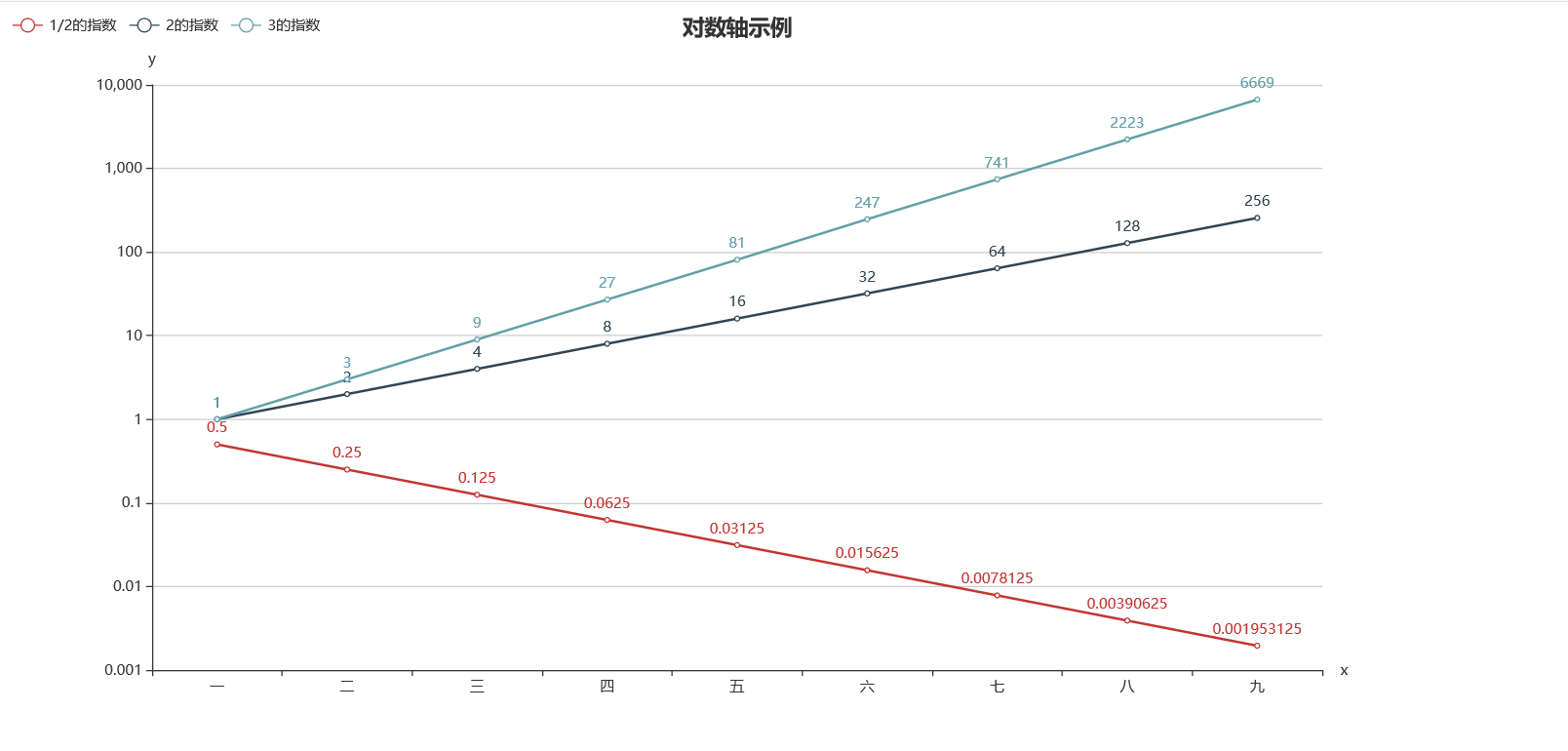
此图例未必用的上,当然也可以作为一个模板分享于此。
import pyecharts.options as opts
from pyecharts.charts import Line
x_data = ["一", "二", "三", "四", "五", "六", "七", "八", "九"]
y_data_3 = [1, 3, 9, 27, 81, 247, 741, 2223, 6669]
y_data_2 = [1, 2, 4, 8, 16, 32, 64, 128, 256]
y_data_05 = [1 / 2, 1 / 4, 1 / 8, 1 / 16, 1 / 32, 1 / 64, 1 / 128, 1 / 256, 1 / 512]
(
Line(init_opts=opts.InitOpts(width="1200px", height="600px"))
.add_xaxis(xaxis_data=x_data)
.add_yaxis(
series_name="1/2的指数",
y_axis=y_data_05,
linestyle_opts=opts.LineStyleOpts(width=2),
)
.add_yaxis(
series_name="2的指数", y_axis=y_data_2, linestyle_opts=opts.LineStyleOpts(width=2)
)
.add_yaxis(
series_name="3的指数", y_axis=y_data_3, linestyle_opts=opts.LineStyleOpts(width=2)
)
.set_global_opts(
title_opts=opts.TitleOpts(title="对数轴示例", pos_left="center"),
tooltip_opts=opts.TooltipOpts(trigger="item", formatter="{a} <br/>{b} : {c}"),
legend_opts=opts.LegendOpts(pos_left="left"),
xaxis_opts=opts.AxisOpts(type_="category", name="x"),
yaxis_opts=opts.AxisOpts(
type_="log",
name="y",
splitline_opts=opts.SplitLineOpts(is_show=True),
is_scale=True,
),
)
.render("对数轴折线图.html")
)
多个折线图展示要注意的是,数据量不能过于的接近,不然密密麻麻的折线,反而让人看起来不舒服。
import pyecharts.options as opts
from pyecharts.charts import Line
from pyecharts.globals import ThemeType
x_data = ["周一", "周二", "周三", "周四", "周五", "周六", "周日"]
y_data = [820, 932, 901, 934, 1290, 1330, 1320]
(
Line({"theme": ThemeType.MACARONS})
.add_xaxis(xaxis_data=x_data)
.add_yaxis(
series_name="邮件营销",
stack="总量",
y_axis=[120, 132, 101, 134, 90, 230, 210],
label_opts=opts.LabelOpts(is_show=False),
)
.add_yaxis(
series_name="联盟广告",
stack="总量",
y_axis=[220, 182, 191, 234, 290, 330, 310],
label_opts=opts.LabelOpts(is_show=False),
)
.add_yaxis(
series_name="视频广告",
stack="总量",
y_axis=[150, 232, 201, 154, 190, 330, 410],
label_opts=opts.LabelOpts(is_show=False),
)
.add_yaxis(
series_name="直接访问",
stack="总量",
y_axis=[320, 332, 301, 334, 390, 330, 320],
label_opts=opts.LabelOpts(is_show=False),
)
.add_yaxis(
series_name="搜索引擎",
stack="总量",
y_axis=[820, 932, 901, 934, 1290, 1330, 1320],
label_opts=opts.LabelOpts(is_show=False),
)
.set_global_opts(
title_opts=opts.TitleOpts(title="折线图堆叠"),
tooltip_opts=opts.TooltipOpts(trigger="axis"),
yaxis_opts=opts.AxisOpts(
type_="value",
axistick_opts=opts.AxisTickOpts(is_show=True),
splitline_opts=opts.SplitLineOpts(is_show=True),
name='数量',
name_location='middle',
name_gap=40,
name_textstyle_opts=opts.TextStyleOpts(
font_family='Times New Roman',
font_size=16
# font_weight='bolder',
)),
xaxis_opts=opts.AxisOpts(type_="category", boundary_gap=False,
name='类别',
name_location='middle',
name_gap=30, # 标签与轴线之间的距离,默认为20,最好不要设置20
name_textstyle_opts=opts.TextStyleOpts(
font_family='Times New Roman',
font_size=16 # 标签字体大小
)),
)
.render("折线图堆叠.html")
)

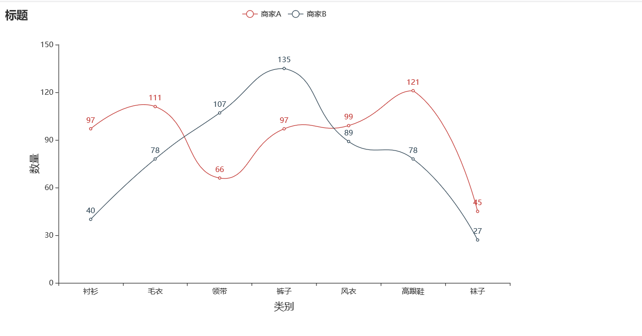
有时候需要在一个图里面进行对比,那么我们应该如何呈现一个丝滑般的曲线折线图呢?看看这个
import pyecharts.options as opts
from pyecharts.charts import Line
from pyecharts.faker import Faker
c = (
Line()
.add_xaxis(Faker.choose())
.add_yaxis("商家A", Faker.values(), is_smooth=True) # 如果不想变成曲线就删除即可
.add_yaxis("商家B", Faker.values(), is_smooth=True)
.set_global_opts(title_opts=opts.TitleOpts(title="标题"),
xaxis_opts=opts.AxisOpts(
name='类别',
name_location='middle',
name_gap=30, # 标签与轴线之间的距离,默认为20,最好不要设置20
name_textstyle_opts=opts.TextStyleOpts(
font_family='Times New Roman',
font_size=16 # 标签字体大小
)),
yaxis_opts=opts.AxisOpts(
name='数量',
name_location='middle',
name_gap=30,
name_textstyle_opts=opts.TextStyleOpts(
font_family='Times New Roman',
font_size=16
# font_weight='bolder',
)),
# toolbox_opts=opts.ToolboxOpts() # 工具选项
)
.render("二维折线图.html")
)
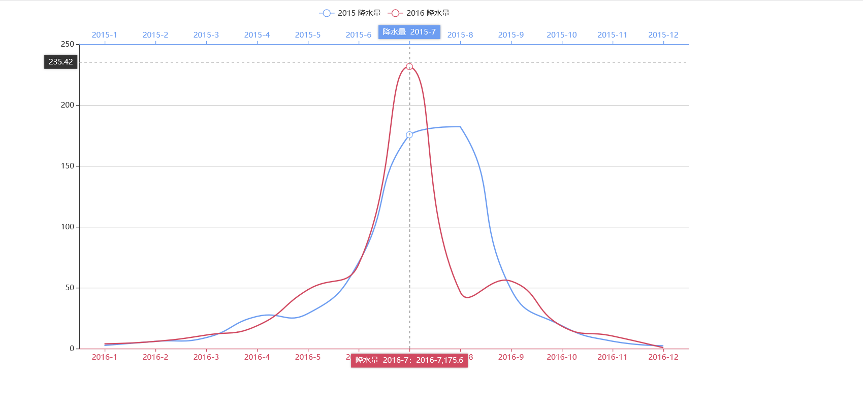
次模板的最大的好处就是可以移动鼠标智能显示数据
import pyecharts.options as opts
from pyecharts.charts import Line
# 将在 v1.1.0 中更改
from pyecharts.commons.utils import JsCode
js_formatter = """function (params) {
console.log(params);
return '降水量 ' + params.value + (params.seriesData.length ? ':' + params.seriesData[0].data : '');
}"""
(
Line(init_opts=opts.InitOpts(width="1200px", height="600px"))
.add_xaxis(
xaxis_data=[
"2016-1",
"2016-2",
"2016-3",
"2016-4",
"2016-5",
"2016-6",
"2016-7",
"2016-8",
"2016-9",
"2016-10",
"2016-11",
"2016-12",
]
)
.extend_axis(
xaxis_data=[
"2015-1",
"2015-2",
"2015-3",
"2015-4",
"2015-5",
"2015-6",
"2015-7",
"2015-8",
"2015-9",
"2015-10",
"2015-11",
"2015-12",
],
xaxis=opts.AxisOpts(
type_="category",
axistick_opts=opts.AxisTickOpts(is_align_with_label=True),
axisline_opts=opts.AxisLineOpts(
is_on_zero=False, linestyle_opts=opts.LineStyleOpts(color="#6e9ef1")
),
axispointer_opts=opts.AxisPointerOpts(
is_show=True, label=opts.LabelOpts(formatter=JsCode(js_formatter))
),
),
)
.add_yaxis(
series_name="2015 降水量",
is_smooth=True,
symbol="emptyCircle",
is_symbol_show=False,
# xaxis_index=1,
color="#d14a61",
y_axis=[2.6, 5.9, 9.0, 26.4, 28.7, 70.7, 175.6, 182.2, 48.7, 18.8, 6.0, 2.3],
label_opts=opts.LabelOpts(is_show=False),
linestyle_opts=opts.LineStyleOpts(width=2),
)
.add_yaxis(
series_name="2016 降水量",
is_smooth=True,
symbol="emptyCircle",
is_symbol_show=False,
color="#6e9ef1",
y_axis=[3.9, 5.9, 11.1, 18.7, 48.3, 69.2, 231.6, 46.6, 55.4, 18.4, 10.3, 0.7],
label_opts=opts.LabelOpts(is_show=False),
linestyle_opts=opts.LineStyleOpts(width=2),
)
.set_global_opts(
legend_opts=opts.LegendOpts(),
tooltip_opts=opts.TooltipOpts(trigger="none", axis_pointer_type="cross"),
xaxis_opts=opts.AxisOpts(
type_="category",
axistick_opts=opts.AxisTickOpts(is_align_with_label=True),
axisline_opts=opts.AxisLineOpts(
is_on_zero=False, linestyle_opts=opts.LineStyleOpts(color="#d14a61")
),
axispointer_opts=opts.AxisPointerOpts(
is_show=True, label=opts.LabelOpts(formatter=JsCode(js_formatter))
),
),
yaxis_opts=opts.AxisOpts(
type_="value",
splitline_opts=opts.SplitLineOpts(
is_show=True, linestyle_opts=opts.LineStyleOpts(opacity=1)
),
),
)
.render("多维颜色多维折线图.html")
)
import pyecharts.options as opts
from pyecharts.charts import Line
from pyecharts.faker import Faker
from pyecharts.globals import ThemeType
c = (
Line({"theme": ThemeType.MACARONS})
.add_xaxis(Faker.choose())
.add_yaxis("商家A", Faker.values(), is_step=True)
.set_global_opts(title_opts=opts.TitleOpts(title="标题"),
xaxis_opts=opts.AxisOpts(
name='类别',
name_location='middle',
name_gap=30, # 标签与轴线之间的距离,默认为20,最好不要设置20
name_textstyle_opts=opts.TextStyleOpts(
font_family='Times New Roman',
font_size=16 # 标签字体大小
)),
yaxis_opts=opts.AxisOpts(
name='数量',
name_location='middle',
name_gap=30,
name_textstyle_opts=opts.TextStyleOpts(
font_family='Times New Roman',
font_size=16
# font_weight='bolder',
)),
# toolbox_opts=opts.ToolboxOpts() # 工具选项
)
.render("阶梯折线图.html")
)
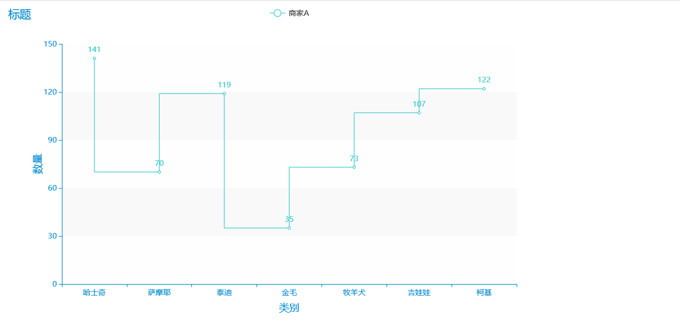
里面的渲染效果相当好看,可以适用于炫酷的展示,数据集可以展示也可以不展示,在相应的位置更改参数即可。
import pyecharts.options as opts
from pyecharts.charts import Line
from pyecharts.commons.utils import JsCode
x_data = ["14", "15", "16", "17", "18", "19", "20", "21", "22", "23","24","25","26","27","28","29","30","31","32","33","34","35","36","37","38","39","40"]
y_data = [393, 438, 485, 631, 689, 824, 987, 1000, 1100, 1200,1500,1000,1700,1900,2000,500,1200,1300,1500,1800,1500,1900,1700,1000,1900,1800,2100,1600,2200,2300]
background_color_js = (
"new echarts.graphic.LinearGradient(0, 0, 0, 1, "
"[{offset: 0, color: '#c86589'}, {offset: 1, color: '#06a7ff'}], false)"
)
area_color_js = (
"new echarts.graphic.LinearGradient(0, 0, 0, 1, "
"[{offset: 0, color: '#eb64fb'}, {offset: 1, color: '#3fbbff0d'}], false)"
)
c = (
Line(init_opts=opts.InitOpts(bg_color=JsCode(background_color_js)))
.add_xaxis(xaxis_data=x_data)
.add_yaxis(
series_name="注册总量",
y_axis=y_data,
is_smooth=True,
is_symbol_show=True,
symbol="circle",
symbol_size=6,
linestyle_opts=opts.LineStyleOpts(color="#fff"),
label_opts=opts.LabelOpts(is_show=True, position="top", color="white"),
itemstyle_opts=opts.ItemStyleOpts(
color="red", border_color="#fff", border_width=3
),
tooltip_opts=opts.TooltipOpts(is_show=False),
areastyle_opts=opts.AreaStyleOpts(color=JsCode(area_color_js), opacity=1),
)
.set_global_opts(
title_opts=opts.TitleOpts(
title="OCTOBER 2015",
pos_bottom="5%",
pos_left="center",
title_textstyle_opts=opts.TextStyleOpts(color="#fff", font_size=16),
),
xaxis_opts=opts.AxisOpts(
type_="category",
boundary_gap=False,
axislabel_opts=opts.LabelOpts(margin=30, color="#ffffff63"),
axisline_opts=opts.AxisLineOpts(is_show=False),
axistick_opts=opts.AxisTickOpts(
is_show=True,
length=25,
linestyle_opts=opts.LineStyleOpts(color="#ffffff1f"),
),
splitline_opts=opts.SplitLineOpts(
is_show=True, linestyle_opts=opts.LineStyleOpts(color="#ffffff1f")
),
),
yaxis_opts=opts.AxisOpts(
type_="value",
position="right",
axislabel_opts=opts.LabelOpts(margin=20, color="#ffffff63"),
axisline_opts=opts.AxisLineOpts(
linestyle_opts=opts.LineStyleOpts(width=2, color="#fff")
),
axistick_opts=opts.AxisTickOpts(
is_show=True,
length=15,
linestyle_opts=opts.LineStyleOpts(color="#ffffff1f"),
),
splitline_opts=opts.SplitLineOpts(
is_show=True, linestyle_opts=opts.LineStyleOpts(color="#ffffff1f")
),
),
legend_opts=opts.LegendOpts(is_show=False),
)
.render("高渲染.html")
)

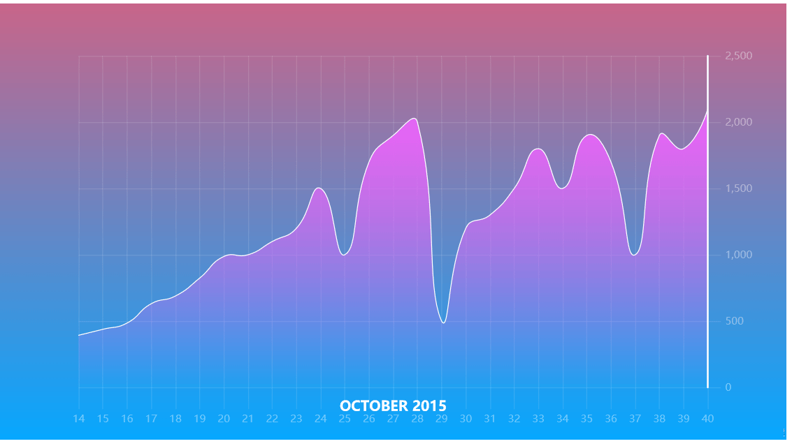
所有图表均可配置,无论是字体的大小,还是颜色,还是背景都可以自己配置哟!下期文章我们继续探索折线图的魅力哟!
到此这篇关于Python可视化神器pyecharts绘制折线图详情的文章就介绍到这了,更多相关python绘制折线图内容请搜索软件开发网以前的文章或继续浏览下面的相关文章希望大家以后多多支持软件开发网!