基于WPF实现控件轮廓跑马灯动画效果
代码如下
一、创建EdgeLight.xaml代码如下。
<ResourceDictionary xmlns="http://schemas.microsoft.com/winfx/2006/xaml/presentation"
                    xmlns:x="http://schemas.microsoft.com/winfx/2006/xaml"
                    xmlns:controls="clr-namespace:WPFDevelopers.Controls">
    <ResourceDictionary.MergedDictionaries>
        <ResourceDictionary Source="Basic/ControlBasic.xaml"/>
    </ResourceDictionary.MergedDictionaries>
    <Style TargetType="{x:Type controls:EdgeLight}" BasedOn="{StaticResource ControlBasicStyle}">
        <Setter Property="BorderBrush" Value="{DynamicResource PrimaryNormalSolidColorBrush}"/>
        <Setter Property="HorizontalContentAlignment" Value="Center"/>
        <Setter Property="VerticalContentAlignment" Value="Center"/>
        <Setter Property="HorizontalAlignment" Value="Center"/>
        <Setter Property="VerticalAlignment" Value="Center"/>
        <Setter Property="Padding" Value="20"/>
        <Setter Property="Template">
            <Setter.Value>
                <ControlTemplate TargetType="{x:Type controls:EdgeLight}">
                    <ControlTemplate.Resources>
                        <Storyboard x:Key="EdgeLightStoryboard">
                            <DoubleAnimation Duration="00:00:0.5"
                                             To="1"
                                             Storyboard.TargetName="PART_Top"
                                             Storyboard.TargetProperty="ScaleX"/>
                            <DoubleAnimation Duration="00:00:0.5"
                                             BeginTime="00:00:0.5"
                                             To="1"
                                             Storyboard.TargetName="PART_Right"
                                             Storyboard.TargetProperty="ScaleY"/>
                            <DoubleAnimation Duration="00:00:.5"
                                             BeginTime="00:00:01"
                                             To="1"
                                             Storyboard.TargetName="PART_Bottom"
                                             Storyboard.TargetProperty="ScaleX"/>
                            <DoubleAnimation Duration="00:00:.5"
                                             BeginTime="00:00:01.5"
                                             To="1"
                                             Storyboard.TargetName="PART_Left"
                                             Storyboard.TargetProperty="ScaleY"/>
                        </Storyboard>
                    </ControlTemplate.Resources>
                    <Grid>
                        <DockPanel LastChildFill="False">
                            <Rectangle DockPanel.Dock="Top" Height="{TemplateBinding LineSize}" Fill="{TemplateBinding BorderBrush}">
                                <Rectangle.RenderTransform>
                                    <ScaleTransform x:Name="PART_Top" ScaleX="0"/>
                                </Rectangle.RenderTransform>
                            </Rectangle>
                            <Rectangle DockPanel.Dock="Right" Width="{TemplateBinding LineSize}" Fill="{TemplateBinding BorderBrush}">
                                <Rectangle.RenderTransform>
                                    <ScaleTransform x:Name="PART_Right" ScaleY="0"/>
                                </Rectangle.RenderTransform>
                            </Rectangle>
                            <Rectangle DockPanel.Dock="Bottom" Height="{TemplateBinding LineSize}" Fill="{TemplateBinding BorderBrush}"
                                   RenderTransformOrigin="1,1">
                                <Rectangle.RenderTransform>
                                    <ScaleTransform x:Name="PART_Bottom" ScaleX="0"/>
                                </Rectangle.RenderTransform>
                            </Rectangle>
                            <Rectangle DockPanel.Dock="Left" Width="{TemplateBinding LineSize}" Fill="{TemplateBinding BorderBrush}"
                                   RenderTransformOrigin="1,1">
                                <Rectangle.RenderTransform>
                                    <ScaleTransform x:Name="PART_Left" ScaleY="0"/>
                                </Rectangle.RenderTransform>
                            </Rectangle>
                        </DockPanel>
                        <ContentPresenter HorizontalAlignment="{TemplateBinding HorizontalContentAlignment}"
                                          Margin="{TemplateBinding Padding}"
                                          VerticalAlignment="{TemplateBinding VerticalContentAlignment}"/>
                    </Grid>
                    <ControlTemplate.Triggers>
                        <Trigger Property="IsAnimation" Value="True">
                            <Trigger.EnterActions>
                                <BeginStoryboard x:Name="beginAnimation"
                                                 Storyboard="{StaticResource EdgeLightStoryboard}" />
                            </Trigger.EnterActions>
                            <Trigger.ExitActions>
                                <StopStoryboard BeginStoryboardName="beginAnimation" />
                            </Trigger.ExitActions>
                        </Trigger>
                    </ControlTemplate.Triggers>
                </ControlTemplate>
            </Setter.Value>
        </Setter>
    </Style>
</ResourceDictionary>
二、EdgeLight.cs代码如下。
using System;
using System.Collections.Generic;
using System.Linq;
using System.Text;
using System.Windows;
using System.Windows.Controls;
using System.Windows.Media;
using System.Windows.Media.Animation;
namespace WPFDevelopers.Controls
{
    public class EdgeLight:ContentControl
    {
        public bool IsAnimation
        {
            get { return (bool)GetValue(IsAnimationProperty); }
            set { SetValue(IsAnimationProperty, value); }
        }
        public static readonly DependencyProperty IsAnimationProperty =
            DependencyProperty.Register("IsAnimation", typeof(bool), typeof(EdgeLight), new PropertyMetadata(false));
        public double LineSize
        {
            get { return (double)GetValue(LineSizeProperty); }
            set { SetValue(LineSizeProperty, value); }
        }
        public static readonly DependencyProperty LineSizeProperty =
            DependencyProperty.Register("LineSize", typeof(double), typeof(EdgeLight), new PropertyMetadata(1.0d));
        static EdgeLight()
        {
            DefaultStyleKeyProperty.OverrideMetadata(typeof(EdgeLight), new FrameworkPropertyMetadata(typeof(EdgeLight)));
        }
    }
}
三、新建EdgeLightExample.cs代码如下。
<UserControl x:Class="WPFDevelopers.Samples.ExampleViews.EdgeLightExample"
             xmlns="http://schemas.microsoft.com/winfx/2006/xaml/presentation"
             xmlns:x="http://schemas.microsoft.com/winfx/2006/xaml"
             xmlns:mc="http://schemas.openxmlformats.org/markup-compatibility/2006"
             xmlns:d="http://schemas.microsoft.com/expression/blend/2008"
             xmlns:local="clr-namespace:WPFDevelopers.Samples.ExampleViews"
             xmlns:wpfdev="https://github.com/yanjinhuagood/WPFDevelopers"
             mc:Ignorable="d"
             d:DesignHeight="450" d:DesignWidth="800">
    <Grid>
        <UniformGrid Columns="2">
            <wpfdev:EdgeLight IsAnimation="{Binding ElementName=myCheckBox,Path=IsChecked}" Margin="10" LineSize="2">
                <CheckBox Content="EdgeLight" x:Name="myCheckBox"/>
            </wpfdev:EdgeLight>
            <wpfdev:EdgeLight IsAnimation="{Binding ElementName=myToggleButton,Path=IsChecked}" Margin="10"
                              BorderBrush="OrangeRed" LineSize="4">
                <ToggleButton Content="EdgeLight2" x:Name="myToggleButton"/>
            </wpfdev:EdgeLight>
        </UniformGrid>
    </Grid>
</UserControl>
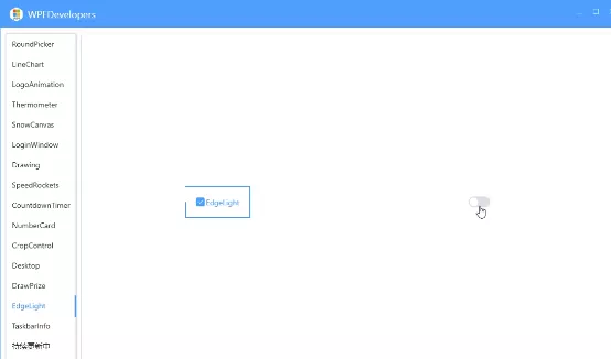
效果预览
到此这篇关于基于WPF实现控件轮廓跑马灯动画效果的文章就介绍到这了,更多相关WPF跑马灯动画内容请搜索软件开发网以前的文章或继续浏览下面的相关文章希望大家以后多多支持软件开发网!
相关文章
Radinka
2021-05-02
Yasmin
2023-05-13
Lala
2023-05-13
Antonia
2023-05-17
Malinda
2023-05-18
Fern
2023-07-20
Isleta
2023-07-20
Belle
2023-07-21
Irisa
2023-07-21
Karima
2023-07-21
Kara
2023-07-21
Leona
2023-07-21
Carmen
2023-07-21
Serena
2023-07-21
Fern
2023-07-21
Meta
2023-07-22
Rochelle
2023-07-22