React-View-UI组件库封装Loading加载中源码
目录
组件介绍
Loading API能力
组件源码
组件测试源码
组件库线上地址
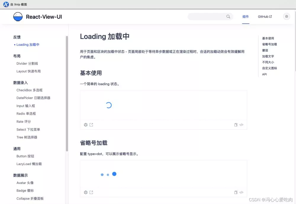
组件介绍Loading组件是日常开发用的很多的组件,这次封装主要包含两种状态的Loading,旋转、省略号,话不多说先看一下组件的文档页面吧:
组件一共提供了如下的API能力,可以在使用时更灵活:

type表示loading类型,默认是default,当用户需要使用省略样式,设置type=dot即可;
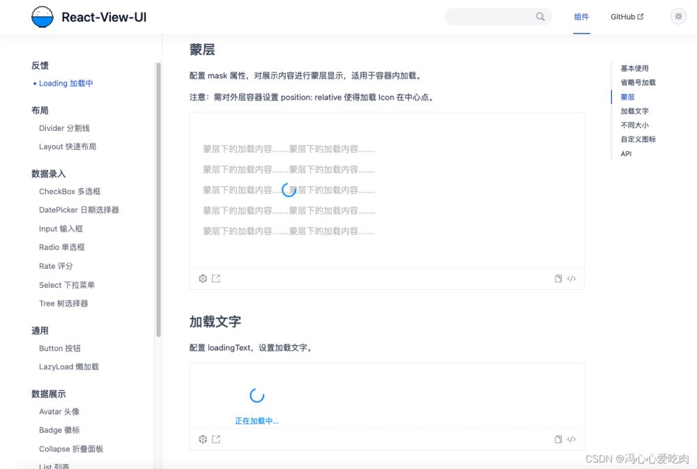
mask配置蒙层,可在loading时遮挡覆盖内容为半透明状态,适用于内容未加载时的遮盖;
loadingText配置加载文字,在图标下显示;
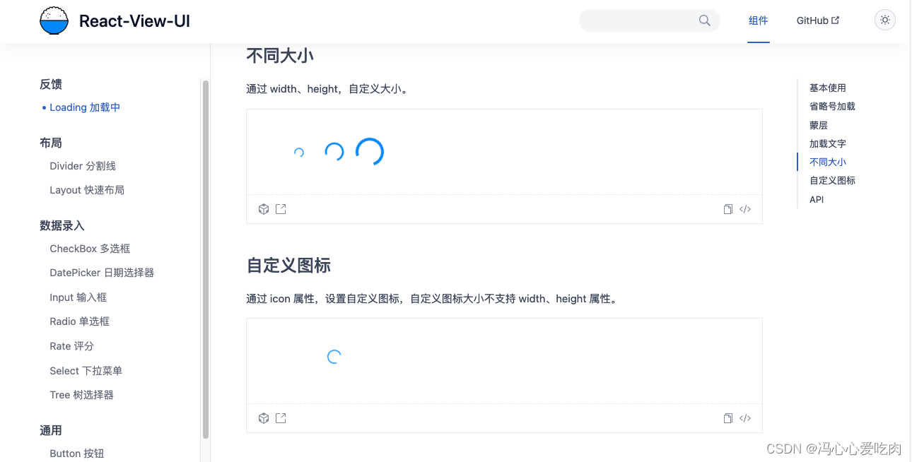
icon配置自定义图标,可配置自己所需要的Icon或svg图标;
width配置自定义宽度;
height配置自定义高度;
style配置loading整体自定义样式;
组件源码index.tsx:
import React, { FC, useEffect, useRef, useState, Fragment, useMemo } from 'react';
import { LoadingProps } from './interface';
import './index.module.less';
const Loading: FC<LoadingProps> = (props) => {
  const {
    type = 'default',
    mask = false,
    loadingText,
    icon,
    width = '2em',
    height = '2em',
    style = {},
  } = props;
  const timer = useRef<any>(null);
  const [activeDotIndex, setActiveDotIndex] = useState(0);
  useEffect(() => {
    timer.current = setInterval(() => {
      setActiveDotIndex((old) => {
        if (old === 2) {
          old = 0;
        } else {
          old++;
        }
        return old;
      });
    }, 500);
    return () => {
      clearInterval(timer.current);
    };
  }, []);
  const loadingStyle = useMemo(() => {
    const returnStyle = style;
    returnStyle.width = width;
    returnStyle.height = height;
    return returnStyle;
  }, [width, height, style]);
  return (
    <Fragment>
      {mask && <div className="dialog" />}
      {type === 'default' ? (
        <div className="loading" style={loadingStyle}>
          <div className="loading-container">
            {icon || (
              <svg
                fill="none"
                stroke="currentColor"
                stroke-width="4"
                width={width}
                height={height}
                viewBox="0 0 48 48"
                aria-hidden="true"
                focusable="false"
              >
                <path d="M42 24c0 9.941-8.059 18-18 18S6 33.941 6 24 14.059 6 24 6"></path>
              </svg>
            )}
          </div>
          {loadingText && <div className="text">{loadingText}</div>}
        </div>
      ) : (
        <div className="dot-loading">
          {new Array(3).fill('').map((item, index) => {
            return <div className={activeDotIndex === index ? 'dot-active' : 'dot'}>{item}</div>;
          })}
        </div>
      )}
    </Fragment>
  );
};
export default Loading;
组件测试源码
loading.test.tsx:
import React from 'react';
import Loading from '../../Loading/index';
import Enzyme from '../setup';
import mountTest from '../mountTest';
import ReactDOM from 'react-dom';
const { mount } = Enzyme;
let container: HTMLDivElement | null;
mountTest(Loading);
describe('loading', () => {
  beforeEach(() => {
    container = document.createElement('div');
    document.body.appendChild(container);
  });
  afterEach(() => {
    document.body.removeChild(container as HTMLDivElement);
    container = null;
  });
  it('test loading show correctly', () => {
    //测试基础加载
    const loading = mount(<Loading />);
    expect(loading.find('.loading .loading-container svg')).toHaveLength(1);
    expect(loading.find('.loading .text')).toHaveLength(0);
  });
  it('test dot loading show correctly', () => {
    //测试省略号加载
    const loading = mount(<Loading type="dot" />);
    expect(loading.find('.dot-loading')).toHaveLength(1);
  });
  it('test mask loading has dialog', () => {
    //测试加载蒙层
    const loading = mount(<Loading mask />);
    expect(loading.find('.dialog')).toHaveLength(1);
  });
  it('test mask loading has dialog', () => {
    //测试加载蒙层
    const loading = mount(<Loading loadingText="test loading" />);
    expect(loading.find('.loading .text').text()).toBe('test loading');
  });
  it('test diffenent size loading show correctly', () => {
    //测试不同大小loading、loading自定义样式
    const component = <Loading width="3em" height="3em" style={{ marginLeft: '100px' }} />;
    ReactDOM.render(component, container);
    const loadingDom = container?.querySelector('.loading');
    expect(
      loadingDom?.getAttribute('style')?.includes('margin-left: 100px; width: 3em; height: 3em;'),
    );
    const svgDom = loadingDom?.querySelector('svg');
    expect(
      svgDom?.getAttribute('width') === '3em' && svgDom?.getAttribute('height') === '3em',
    ).toBe(true);
  });
});
组件库线上地址
React-View-UI组件库线上链接:http://react-view-ui.com:92/#
github:https://github.com/fengxinhhh/React-View-UI-fs
npm:https://www.npmjs.com/package/react-view-ui
到此这篇关于React-View-UI组件库封装——Loading加载中的文章就介绍到这了,更多相关React-View-UI组件库内容请搜索软件开发网以前的文章或继续浏览下面的相关文章希望大家以后多多支持软件开发网!
相关文章
Yasmin
2021-05-01
Vanora
2020-07-25
Ramya
2020-01-01
Nova
2023-07-20
Beth
2023-07-20
Viridis
2023-07-20
Georgia
2023-07-20
Shaine
2023-07-20
Isleta
2023-07-20
Jacinda
2023-07-20
Yvonne
2023-07-20
Kathy
2023-07-20
Viridis
2023-07-21
Octavia
2023-07-21
Bertha
2023-07-21
Adonia
2023-07-21
Ophelia
2023-07-21
Xanthe
2023-07-21
Querida
2023-07-21