css布局教程之如何实现垂直居中
前言
最近在总结前端知识,也参加了一些面试,面试中遇到一道题要求垂直居中,现在对这进行一下总结,也好巩固一下知识。
css实现垂直居中
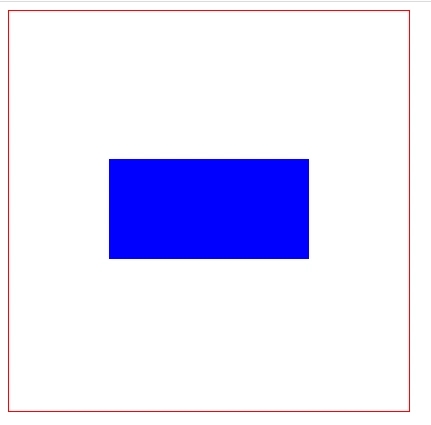
1.利用line-height实现居中,这种方法适合纯文字类的;
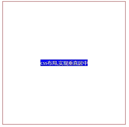
<!-- css -->
<style>
.parents {
  height: 400px;
  line-height: 400px;
  width: 400px;
  border: 1px solid red;
  text-align: center;
}
.child {
  background-color: blue;
  color: #fff;
}
 </style>
</head>
<body>
<!-- html -->
<div class="parents">
   <span class="child">css布局,实现垂直居中</span>
</div>
</body>
2.通过设置父容器相对定位,子级设置绝对定位,标签通过margin实现自适应居中;
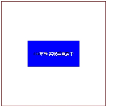
<!-- css -->
<style>
.parents {
  height: 400px;
  width: 400px;
  border: 1px solid red;
  position: relative;
}
.child {
  width: 200px;
  height: 100px;
  line-height: 100px;
  text-align: center;
  color: #fff;
  background-color: blue;
  /* 四个方向设置为0, 然后通过margin为auto自适应居中 */
  position: absolute;
  top: 0;
  right: 0;
  bottom: 0;
  left: 0;
  margin: auto;
}
 </style>
</head>
<body>
<!-- html -->
<div class="parents">
  <span class="child">css布局,实现垂直居中</span>
</div>
</body>
3.弹性布局flex 父级设置display: flex; 子级设置margin为auto实现自适应居中;
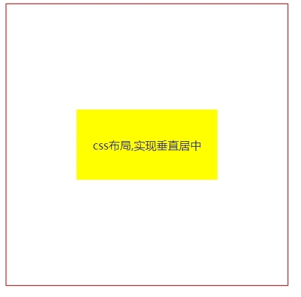
  <!-- css -->
  <style>
    .parents {
      height: 400px;
      width: 400px;
      border: 1px solid red;
      display: flex;
    }
    .child {
      width: 200px;
      height: 100px;
      line-height: 100px;
      text-align: center;
      color: #333;
      background-color: yellow;
      margin: auto;
  }
 </style>
</head>
<body>
 <!-- html -->
  <div class="parents">
    <span class="child">css布局,实现垂直居中</span>
  </div>
</body>
4. 父级设置相对定位,子级设置绝对定位,并且通过位移transform实现;
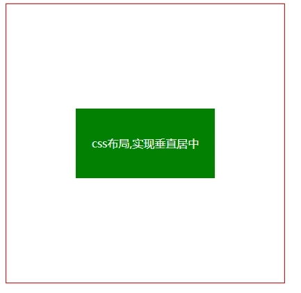
  <!-- css -->
  <style>
    .parents {
      height: 400px;
      width: 400px;
      border: 1px solid red;
      position: relative;
    }
    .child {
      width: 200px;
      height: 100px;
      line-height: 100px;
      text-align: center;
      color: #fff;
      background-color: green;
      position: absolute;
      top: 50%;
      left: 50%;
      transform: translate(-50%, -50%);
    }
  </style>
</head>
<body>
  <!-- html -->
  <div class="parents">
    <span class="child">css布局,实现垂直居中</span>
  </div>
</body>
5. 父级设置弹性盒子,并设置弹性盒子相关属性;
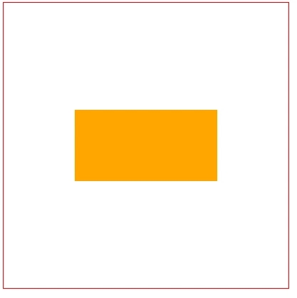
 <!-- css -->
 <style>
    .parents {
      height: 400px;
      width: 400px;
      border: 1px solid red;
      display: flex;
      justify-content: center; /* 水平 */
      align-items: center; /* 垂直 */
    }
    .child {
      width: 200px;
      height: 100px;
      color: black;
      background-color: orange;
    }
  </style>
</head>
<body>
  <!-- html -->
  <div class="parents">
    <span class="child"></span>
  </div>
</body>
6. 网格布局,父级通过转换成表格形式,然后子级设置行内或行内块实现。(需要注意的是:vertical-align: middle使用的前提条件是内联元素以及display值为table-cell的元素)。
 <!-- css -->
 <style>
    .parents {
      height: 400px;
      width: 400px;
      border: 1px solid red;
      display: table-cell;
      text-align: center;
      vertical-align: middle;
    }
    .child {
      width: 200px;
      height: 100px;
      color: #fff;
      background-color: blue;
      display: inline-block; /* 子元素设置行内或行内块 */
    }
  </style>
</head>
<body>
  <!-- html -->
  <div class="parents">
    <span class="child"></span>
  </div>
</body>
总结
以上就是这篇文章的全部内容了,希望本文的内容对大家的学习或者工作具有一定的参考学习价值,谢谢大家对软件开发网的支持。
相关文章
Laurie
2020-11-30
Kara
2021-05-30
Winola
2023-07-20
Dulcea
2023-07-21
Malina
2023-07-21
Tia
2023-07-21
Lida
2023-07-21
Bonnie
2023-07-21
Tia
2023-07-21
Lala
2023-07-21
Tallulah
2023-07-21
Crystal
2023-07-21
Kersen
2023-07-21
Bonnie
2023-07-21
Echo
2023-07-22
Phemia
2023-07-22
Pelagia
2023-07-22
Rhoda
2023-07-22
Diane
2023-08-08
Olinda
2023-08-08