jQuery插件HighCharts绘制2D柱状图、折线图的组合双轴图效果示例【附demo源码下载】
本文实例讲述了jQuery插件HighCharts绘制2D柱状图、折线图的组合双轴图效果。分享给大家供大家参考,具体如下:
1、实例代码:
<!DOCTYPE html>
<html>
<head>
<meta charset="UTF-8">
<title>HighCharts 2D柱状图、折线图的组合双轴图</title>
<script type="text/javascript" src="js/jquery-1.7.2.min.js"></script>
<script type="text/javascript" src="js/highcharts.js"></script>
<script type="text/javascript">
   $(function(){
     $('#doubleColumnLineChart').highcharts({
       chart: {
         zoomType: 'xy'
       },
       title: {
         text: '(jb51.net)某城市的月平均温度和降雨量'
       },
       xAxis: [{
         categories: ['一月', '二月', '三月', '四月', '五月', '六月','七月', '八月', '九月', '十月', '十一月', '十二月']
       }],
       yAxis: [{ // 主Y轴
         labels: {
           format: '{value}°C',
           style: {
             color: '#89A54E',
             fontSize: '12px'
           }
         },
         title: {
           text: '温度',
           style: {
             color: '#89A54E',
             fontSize: '12px'
           }
         }
       }, { // 次Y轴
         title: {
           text: '降雨量',
           style: {
             color: '#4572A7'
           }
         },
         labels: {
           format: '{value} mm',
           style: {
             color: '#4572A7'
           }
         },
         opposite: true
       }],
       tooltip: {
         shared: true
       },
       legend: {
         layout: 'vertical',
         align: 'left',
         x: 120,
         verticalAlign: 'top',
         y: 100,
         floating: true,
         backgroundColor: '#FFFFFF'
       },
       series: [{
         name: '降雨量',
         color: '#4572A7',
         type: 'column',
         yAxis: 1,
         data: [9.9, 51.5, 16.4, 129.2, 44.0, 76.0, 35.6, 148.5, 116.4, 104.1, 95.6, 154.4],
         tooltip: {
           valueSuffix: ' mm'
         }
       }, {
         name: '温度',
         color: '#89A54E',
         type: 'spline',
         data: [7.0, 6.9, 9.5, 14.5, 18.2, 21.5, 35.2, 26.5, 13.3, 18.3, 13.9, 2.6],
         tooltip: {
           valueSuffix: '°C'
         }
       }]
     });
   });
</script>
</head>
<body>
  <div id="doubleColumnLineChart" style="width: 1200px; height: 500px; margin: 0 auto"></div>
</body>
</html>
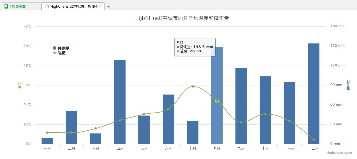
2、运行效果图:
附:完整实例代码点击此处本站下载。
更多关于jQuery相关内容感兴趣的读者可查看本站专题:《jQuery常用插件及用法总结》、《jquery中Ajax用法总结》、《jQuery表格(table)操作技巧汇总》、《jQuery扩展技巧总结》、《jQuery常见经典特效汇总》及《jquery选择器用法总结》
希望本文所述对大家jQuery程序设计有所帮助。
相关文章
Rosine
2020-08-13
Maha
2020-11-26
Kita
2021-05-26
Karli
2020-06-05
Faith
2023-07-21
Chipo
2023-07-21
Jacinthe
2023-07-22
Winona
2023-07-22
Ophelia
2023-07-22
Agnes
2023-07-22
Aurora
2023-07-22
Glory
2023-07-22
Pelagia
2023-07-22
Ianthe
2023-07-22
Nafisa
2023-07-22
Nora
2023-07-28
Rhea
2023-08-08
Kara
2023-08-08