Android Compose实现底部按钮以及首页内容详细过程第1/2页
前言
Column、Row、ConstraintLayout布局先知
Column纵向排列布局
Row横向排列布局
ConstraintLayout 约束布局
Modifier的简单使用
底部导航栏的实现
首页内容的实现
Banner的实现
首页ViewModel
compose作为Android现在主推的UI框架,各种文章铺天盖地的席卷而来,作为一名Android开发人员也是很有必要的学习一下了,这里就使用wanandroid的开放api来编写一个compose版本的玩安卓客户端,全当是学习了,各位大佬轻喷~
先来看一下首页的效果图:

从图片中可以看到首页的内容主要分为三部分,头部标题栏,banner,数据列表,底部导航栏;今天就实现这几个功能。
Column、Row、ConstraintLayout布局先知在Compose布局中主要常用的就是这三个布局,分别代表纵向排列布局,横向排列布局,以及约束布局;先大概了解一下用法,以及布局包裹内部元素的排列方便在项目中更好的使用。
Column纵向排列布局Column主要是将布局包裹内的元素由上至下垂直排列显示,类似于Recyclerview的item,简单来看一段代码:
@Preview
@Composable
fun ColumnItems(){
    Column {
        Text(text = "我是第一个Column元素",Modifier.background(Color.Gray))
        Text(text = "我是第二个Column元素",Modifier.background(Color.Green))
        Text(text = "我是第三个Column元素",Modifier.background(Color.LightGray))
    }
}
可以看到在一个Column里面包裹了三个Text,那么来看一下效果:
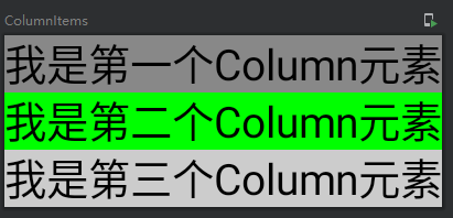
可以看到所有元素是由上至下进行排列的。
Row横向排列布局简而言之就是将布局里面的元素一个一个的由左到右横向排列。
再来看一段简短的代码:
@Preview
@Composable
fun RowItems(){
    Row {
        Text(text = "我是第一个Row元素",Modifier.background(Color.Gray).height(100.dp))
        Text(text = "我是第二个Row元素",Modifier.background(Color.Green).height(100.dp))
        Text(text = "我是第三个Row元素",Modifier.background(Color.LightGray).height(100.dp))
    }
}
在Row里面同样包裹了三个Text文本,再来看一下效果:
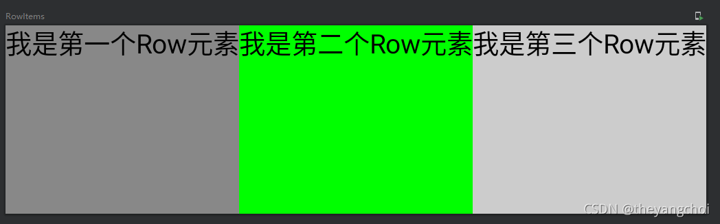
可以看到Row里面的元素是由左到右横向进行排列的。
ConstraintLayout 约束布局在compose里面同样可以使用约束布局,主要主用于一些Column或者Row或者Box布局无法直接实现的布局,在实现更大的布局以及有许多复杂对齐要求以及布局嵌套过深的场景下,ConstraintLayout 用起来更加顺手,在使用ConstraintLayout 之前需要先导入相关依赖包:
implementation "androidx.constraintlayout:constraintlayout-compose:1.0.0-rc01"
这里额外提一句,在你创建项目的时候所有compose的相关依赖包都要和你项目当前的compose版本一致,或者都更新到最新版,如果compose的版本大于你现在导入的其他依赖库的版本,那么就会报错。
在使用ConstraintLayout需要注意以下几点:
声明元素 通过 createRefs() 或 createRef() 方法初始化声明的,并且每个子元素都会关联一个ConstraintLayout 中的 Composable 组件;
关联组件 Modifier.constrainAs(text)通过constrainAs关联组件
约束关系可以使用 linkTo 或其他约束方法实现;
parent 是一个默认存在的引用,代表 ConstraintLayout 父布局本身,也是用于子元素的约束关联。
来看一段代码:
@Preview
@Composable
fun ConstraintLayoutDemo(){
    ConstraintLayout {
        //声明元素
        val (text,text2,text3) = createRefs()
        Text(text = "我是第一个元素",Modifier.height(50.dp).constrainAs(text){
            //将第一个元素固定到父布局的右边
            end.linkTo(parent.end)
        })
        Text(text = "老二",modifier = Modifier.background(Color.Green).constrainAs(text2){
            //将第二个元素定位到第一个元素的底部
            top.linkTo(text.bottom)
            //,然后于第一个元素居中
            centerTo(text)
        })
        Text(text = "老三",modifier = Modifier.constrainAs(text3){
            //将第三个元素定位到第二个元素的底部
            top.linkTo(text2.bottom)
            //将第三个元素定位在第二个元素的右边
            start.linkTo(text2.end)
        })
    }
}
看一下效果:
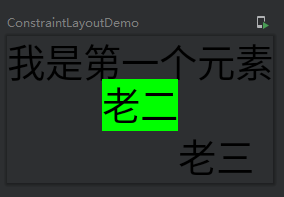
约束布局只要习惯linkTo的使用就能很好的使用该布局。
Modifier的简单使用Modifier在compose里面可以设置元素的宽高,大小,背景色,边框,边距等属性;这里只介绍一些简单的用法。
先看一段代码:
modifier = Modifier
//            .fillMaxSize()//横向  纵向 都铺满,设置了fillMaxSize就不需要设置fillMaxHeight和fillMaxWidth了
//            .fillMaxHeight()//fillMaxHeight纵向铺满
            .fillMaxWidth()//fillMaxWidth()横向铺满  match
            .padding(8.dp)//外边距 vertical = 8.dp 上下有8dp的边距;  horizontal = 8.dp 水平有8dp的边距
            .padding(8.dp)//内边距  padding(8.dp)=.padding(8.dp,8.dp,8.dp,8.dp)左上右下都有8dp的边距
//            .width(100.dp)//宽100dp
//            .height(100.dp)//高100dp
            .size(100.dp)//宽高 100dp
//            .widthIn(min: Dp = Dp.Unspecified, max: Dp = Dp.Unspecified)//设置自身的最小和最大宽度(当子级元素超过自身时,子级元素超出部分依旧可见);
            .background(Color.Green)//背景颜色
            .border(1.dp, Color.Gray,shape = RoundedCornerShape(20.dp))//边框
fillMaxSize 设置布局纵向横向都铺满
fillMaxHeight 设置布局铺满纵向
fillMaxWidth 设置布局铺满横向,这三个属性再使用了fillMaxSize 就没必要在设置下面两个了
padding 设置边距,方向由左上右下设置,添加了vertical就是设置垂直的上下边距,horizontal设置了水平的左右边距。这里注意写了两个padding,第一个是外边距,第二个是内边距,外边距最好是放在Modifier的第一个元素。
width 设置元素的宽
height 设置元素的高
size 设置元素大小,只有一个值时宽高都是一个值,.size(100.dp,200.dp)两个值前者是宽,后者是高
widthIn 设置自身的最小和最大宽度(当子级元素超过自身时,子级元素超出部分依旧可见)
background 设置元素的背景颜色
border 设置边框,参数值:边框大小,边框颜色,shape
更多Modifier的设置可以查看源码或者官方文档。
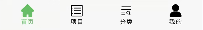
底部导航栏的实现从图中可以可以出,底部导航栏主要包含四个tab,分别是首页、项目、分类以及我的,而每个tab又分别包含一张图片和一个文字。
具体实现步骤:
1.编写每个tab的样式,这里要使用到Column进行布局,Column列的意思,就是Column里面的元素会一个顺着一个往下排的意思,所以我们需要在里面放一个图片Icon和一个文本Text。
Column(
   modifier.padding(vertical = 8.dp),//垂直(上下边距)8dp
   horizontalAlignment = Alignment.CenterHorizontally) {//对齐方式水平居中
   Icon(painter = painterResource(id = iconId),//图片资源
        contentDescription = tabName,//描述
        //图片大小//颜色
        modifier = Modifier.size(24.dp),tint = tint)
        //      文本字体大小字体颜色
   Text(text = tabName,fontSize = 11.sp,color = tint)
}
因为是四个按钮,并且有着选中和未选中的状态,所以我们需要封装成一个方法进行使用:
/**
 * 参数解析
 * @DrawableRes iconId: Int
 *
 * iconId  参数名称
 * Int     参数类型
 * @DrawableRes 只能填入符合当前属性的值
 * */
@Composable
private fun TabItem(@DrawableRes iconId: Int, //tab 图标资源
                    tabName: String,//tab 名称
                    tint: Color,//tab 颜色(选中或者未选中状态)
                    modifier: Modifier = Modifier
){
    Column(
        modifier.padding(vertical = 8.dp),
        horizontalAlignment = Alignment.CenterHorizontally) {
        Icon(painter = painterResource(id = iconId),
            contentDescription = tabName,
            modifier = Modifier.size(24.dp),tint = tint)
        Text(text = tabName,fontSize = 11.sp,color = tint)
    }
}
2.使用Row放置四个TabItem,Row水平排列的意思。
@Composable
fun BottomBar(modifier: Modifier = Modifier, content: @Composable RowScope.() -> Unit) {
    Row(
        modifier
            .fillMaxWidth()
            .background(ComposeUIDemoTheme.colors.bottomBar)
            .padding(4.dp, 0.dp)
            .navigationBarsPadding(),
        content = content
    )
}
@Composable
fun BottomTabBar(selectedPosition: Int, currentChanged: (Int) -> Unit){
//使用Row将四个TabItem包裹起来,让它们水平排列
    BottomBar() {
        TabItem(
            iconId = if (selectedPosition == 0) R.drawable.home_selected else R.drawable.home_unselected,
            tabName = "首页",
            tint = if (selectedPosition == 0) ComposeUIDemoTheme.colors.iconCurrent else ComposeUIDemoTheme.colors.icon,
            Modifier
                .clickable {
                    currentChanged(0)
                }
                .weight(1f))
        TabItem(
            iconId = if (selectedPosition == 1) R.drawable.project_selected else R.drawable.project_unselected,
            tabName = "项目",
            tint = if (selectedPosition == 1) ComposeUIDemoTheme.colors.iconCurrent else ComposeUIDemoTheme.colors.icon,
            Modifier
                .clickable {
                    currentChanged(1)
                }
                .weight(1f))
        TabItem(
            iconId = if (selectedPosition == 2) R.drawable.classic_selected else R.drawable.classic_unselected,
            tabName = "分类",
            tint = if (selectedPosition == 2) ComposeUIDemoTheme.colors.iconCurrent else ComposeUIDemoTheme.colors.icon,
            Modifier
                .clickable {
                    currentChanged(2)
                }
                .weight(1f))
        TabItem(iconId = if (selectedPosition == 3) R.drawable.mine_selected else R.drawable.mine_unselected,
            tabName = "我的",
            tint = if (selectedPosition == 3) ComposeUIDemoTheme.colors.iconCurrent else ComposeUIDemoTheme.colors.icon,
            Modifier
                .clickable {
                    currentChanged(3)
                }
                .weight(1f))
    }
}
TabItem填充解析:
iconId tab图标资源,当选中的下标等于当前tab的下标时显示选中的资源,否则显示非选中资源
tabName tab文本
tint tab 颜色,同样分为选中和未选中
Modifier 使用Modifier设置点击事件,以及权重
currentChanged(0) tabitem的点击事件,返回当前item的下标
TabItem(
   iconId = if (selectedPosition == 0) R.drawable.home_selected elseR.drawable.home_unselected,
   tabName = "首页",
   tint = if (selectedPosition == 0) ComposeUIDemoTheme.colors.iconCurrent else ComposeUIDemoTheme.colors.icon,
   Modifier
        .clickable {
             currentChanged(0)
        }
        .weight(1f))
3.分别创建HomePage、ProjectPage、ClassicPage和MinePage四个页面,页面编写一些简单的代码铺满页面即可。
@Composable
fun ClassicPage(viewModel: BottomTabBarViewModel = viewModel()){
    Column(Modifier.fillMaxWidth()) {
        DemoTopBar(title = "分类")
        Box(
            Modifier
                .background(ComposeUIDemoTheme.colors.background)
                //使用Modifier将页面铺满
                .fillMaxSize()
        ) {
            Text(text = "分类")
        }
    }
}
4.使用HorizontalPager进行页面滑动,并且与tabitem的点击事件进行绑定,达到页面滑动切换以及点击tabitem进行切换的效果。
HorizontalPager主要参数解析:
count 总页面数
state 当前选中的页面状态
使用HorizontalPager需要导入以下资源:
implementation "com.google.accompanist:accompanist-pager:$accompanist_pager"//0.20.2
具体实现步骤如下:
先通过remember记录住当前选中的下标,这个主要作用与tabItem的切换
//记录页面状态
val indexState = remember { mutableStateOf(0) }
然后通过rememberPagerState记录HorizontalPager的currentPager也就是当前页面下标
val pagerState = rememberPagerState()
使用HorizontalPager填充页面
HorizontalPager(count = 4,
   state = pagerState,
   modifier = Modifier.fillMaxSize().weight(1f))
    { page: Int ->
         when(page){
             0 ->{
             HomePage()
             }
             1 ->{
                ProjectPage()
             }
             2 ->{
                ClassicPage()
             }
             3 ->{
                 MinePage()
             }
     }
}
使用LaunchedEffect进行页面切换
//页面切换
LaunchedEffect(key1 = indexState.value, block = {
      pagerState.scrollToPage(indexState.value)
})
最后绑定底部导航栏并绑定点击事件
//滑动绑定底部菜单栏
/**
selectedPosition = pagerState.currentPage
将当前的currentPager赋值给tabitem的selectPosition对底部导航栏进行绑定
indexState.value = it
将底部导航栏的点击回调下标赋值给indexState对pager进行绑定
*/
BottomTabBar(selectedPosition = pagerState.currentPage){
       indexState.value = it
}
到这里就能实现一个底部导航栏以及四个页面的切换了。
首页内容的实现Banner的实现
因为获取Banner数据要进行网络请求,至于网络封装就不贴代码了,这里直接从ViewModel开始展示,具体的网络代码可以移步到项目进行观看。
首页ViewModel主要用于Banner和首页文章列表的网络请求:
class HomeViewModel : ViewModel() {
    private var _bannerList = MutableLiveData(listOf<BannerEntity>())
    val bannerList:MutableLiveData<List<BannerEntity>>  = _bannerList
    fun getBannerList(){
        NetWork.service.getHomeBanner().enqueue(object : Callback<BaseResult<List<BannerEntity>>>{
            override fun onResponse(call: Call<BaseResult<List<BannerEntity>>>,response: Response<BaseResult<List<BannerEntity>>>) {
                response.body()?.let {
                    _bannerList.value = it.data
                }
            }
            override fun onFailure(call: Call<BaseResult<List<BannerEntity>>>, t: Throwable) {
            }
        })
    }
    private var _articleData = MutableLiveData<ArticleEntityPage>()
    val articleData:MutableLiveData<ArticleEntityPage> = _articleData
    fun getArticleData(){
        NetWork.service.getArticleList().enqueue(object : Callback<BaseResult<ArticleEntityPage>>{
            override fun onResponse(call: Call<BaseResult<ArticleEntityPage>>,response: Response<BaseResult<ArticleEntityPage>>) {
                response.body()?.let {
                    articleData.value = it.data
                }
            }
            override fun onFailure(call: Call<BaseResult<ArticleEntityPage>>, t: Throwable) {
            }
        })
    }
}
在调用HomePage的时候将HomeViewModel传入进去,不推荐直接在compose里面直接调用,会重复调用:
val bVM = HomeViewModel()
HomePage(bVM = bVM)
HomePage的创建:
fun HomePage(viewModel: BottomTabBarViewModel = viewModel(), bVM:HomeViewModel){
}
数据调用进行请求,首先要创建变量通过observeAsState进行数据接收刷新
val bannerList by bVM.bannerList.observeAsState()
Compose的网络请求要放到LaunchedEffect去执行,才不会重复请求数据
val requestState = remember { mutableStateOf("") }
LaunchedEffect(key1 = requestState.value, block = {
   bVM.getBannerList()
})
绘制Banner的View,这里同样使用到HorizontalPager,并且还使用了coil进行网络加载,需要导入相关依赖包
implementation 'io.coil-kt:coil-compose:1.3.0'
BannerView的代码,实现大致和tabitem差不多,只是添加了一个轮播,就不做过多的极细,直接贴代码了
@ExperimentalCoilApi
@ExperimentalPagerApi
@Composable
fun BannerView(bannerList: List<BannerEntity>,timeMillis:Long){
Box(
Modifier
.fillMaxWidth()
.height(160.dp)) {
val pagerState = rememberPagerState()
var executeChangePage by remember { mutableStateOf(false) }
var currentPageIndex = 0
HorizontalPager(count = bannerList.size,
state = pagerState,
modifier = Modifier
.pointerInput(pagerState.currentPage) {
awaitPointerEventScope {
while (true) {
val event = awaitPointerEvent(PointerEventPass.Initial)
val dragEvent = event.changes.firstOrNull()
when {
dragEvent!!.positionChangeConsumed() -> {
return@awaitPointerEventScope
}
dragEvent.changedToDownIgnoreConsumed() -> {
//记录下当前的页面索引值
currentPageIndex = pagerState.currentPage
}
dragEvent.changedToUpIgnoreConsumed() -> {
if (pagerState.targetPage == null) return@awaitPointerEventScope
if (currentPageIndex == pagerState.currentPage && pagerState.pageCount > 1) {
executeChangePage = !executeChangePage
}
}
}
}
}
}
.clickable {
Log.e(
"bannerTAG",
"点击的banner item:${pagerState.currentPage} itemUrl:${bannerList[pagerState.currentPage].imagePath}"
)
}
.fillMaxSize()) { page ->
Image(
painter = rememberImagePainter(bannerList
12下一页阅读全文